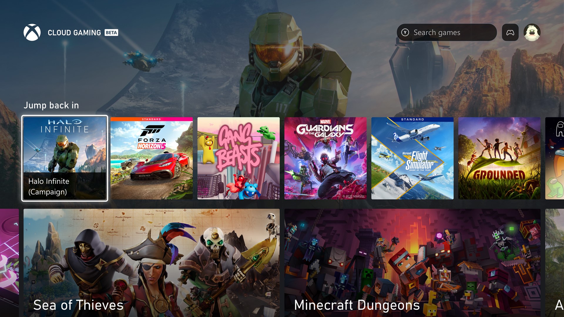
The new Xbox dashboard design, which Microsoft is planning for 2023, is being torn apart by the fans.
A new design is always a matter of taste, but Microsoft doesn’t seem to be doing itself any favors with the new dashboard. Criticism is pouring in everywhere and many Xbox fans are venting their frustration and complaining about the look and feel – and admittedly, that little something extra is simply missing, isn’t it?
Here is a picture of the new planned design:
The biggest criticism from fans is that the wallpaper is too obscured and it has no real touch at all. Not only do the tiles vary in width and feel somewhat out of place, but the smaller navigation bars bother many Xbox users. The majority would rather have a “Clean & Simple” than a jam-packed start page.
Clean & Simple can Xbox fan “toilet seat‘ capture graphically particularly well what he has often demonstrated. So he immediately came forward with his version of the new dashboard, which you can see here:

Image via @Klobrille – Twitter
In this example, the focus on the start page is clearly on the background image, which should change depending on the “selected tile”. So if you switch to Halo Infinite in this example, a wallpaper of Halo would load. How you go about putting that into action and how much it would affect load times remains to be seen. Nevertheless, everything seems a bit more correct at first sight.
Now let’s look at an image of the new dashboard again:

Image via @Souls_Ninja – Twitter
It immediately becomes clear that there doesn’t seem to be a correct alignment and the design looks very untidy, just not consistent. The mere fact that the lower right options bar lies slightly over the next tiles seems immature.
Microsoft has announced that there will be important updates in this first round of previews:
- The new “skip back” row provides quick access to recently played games and apps.
- Easy access to essential system apps like Settings, Store, Search, and My Games & Apps with their own tiles on Xbox Home.
- Unified design and visual identifiers with updated layouts to keep the experience familiar.
- If you scroll down, you’ll see curated categories and recommendations tailored to your gaming preferences.
The Xbox fan and graphic artist “soul_ninja‘ has also played around with the dashboard, this time taking inspiration from the Windows Fluent design:
In this design, the selected tiles are larger, so the focus of the controller is visualized once again. The background image is clearly visible, while the tiles are slightly smaller. There is also an info area that shows statistics about the game.
An important note comes from “Hey Mr Zweistein“, who also pointed out that despite all the criticism, Microsoft developers have to consider many things that any graphic artist may not have considered in their designs. Consider issues such as compatibility and the needs of people with disabilities – vision, color blindness and others.
You can’t always please everyone in the end, but we think it would make sense for Microsoft to give all Xbox owners more layout customization options. In this way, you could offer different grid models to choose from in the dashboard settings and if you want, you could simply choose your favorite from the three designs (listed here), for example. Or you can make a uniform design that has additional customization options especially for people with disabilities.
Who with the current draft for the Xbox dashboard theme 2023 If you don’t know what to do at all, not only should you send in your feedback through the Xbox Insider Program, but also note that Microsoft has officially announced that they are starting a multi-month test series to find out how they can make the start screen even more personalizing and some of the most important trends and fan wishes. So it sounds like Microsoft has other startup layouts up its sleeve.
Which of these three designs do you like best and what changes do you have for the new Xbox dashboard design?
 = Partner & affiliate links: Possible listed offers are usually provided with so-called affiliate links. With a purchase through one of these links you support Xboxdynasty. Without affecting the price, we receive a small commission from the provider and can offer this website to you free of charge.


