It is already a certainty that Google is conquering cars, both with projects in which it is associated with manufacturers and with devices with Android Auto.
[Cómo tener Android Auto sin cables en cualquier coche con este sistema]
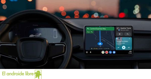
The time has shown that apostar for Android Auto as an independent system has tenido éxito, y la próxima actualización del system renovará esta apuesta con una nueva interfaz para obtention una standard experiencia en all los coches, sin importar el tipo ni el tamaño de la pantalla having.
The new Android Auto interface
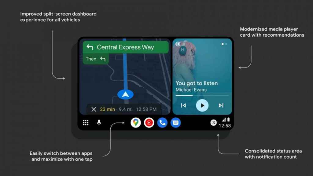
The most obvious change in the new Android Auto is that the items are larger and easier to use on a touchscreen, like the one almost all new cars already have from the factory. In addition, these elements have been moved to make them more accessible.
New Android Auto interface
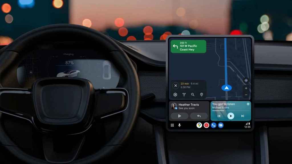
For example, a big change is that the Google Maps view will now be closer to the driver, which should improve visibility; We no longer need to look away to see what the next indication is or to know where we are. It is obvious that the map has taken on a lot of importance, to the point that the rest of the elements always change places to keep it as close as possible to our field of vision. We will even have the possibility of making the map occupy the entire screen, allowing us to choose between several different views.
This also means that some items are able to change size, prioritize the map, or just not take up as much space if they don’t need to. We have an example of this in the media player, which no longer needs to take up half the screen and can dynamically leave more space for other applications.
New Android Auto interface on large screens
Speaking of apps, now Android Auto will always have a bar (at the bottom or on the side depending on the screen) which will house the open and recent apps, allowing us to easily switch between them; and if we give a touch we can maximize them. In this bar we will also find data such as time and notification indicators, in addition to the personal assistant button and access to the applications menu.
Many people use Android Auto to listen to music, and for this reason Google Assistant will now show us media recommendations just by swiping on the screen. Finally, the whole system has been upgraded to Material You, just like smartphones, to modernize the visual style.
The new Android Auto is already in public beta; unfortunately, no one can register anymore, so we will have to wait for the public launch to test it in our car.
You may be interested
Follow the topics that interest you




.jpg/BROK/thumbnail/1600x900/format/jpg/quality/80/pokemon_go_silent_schemes_1-(1).jpg)