Be sure to cast your votes in the poll below; but first, let’s look at the box designs themselves.
North America / Europe

The design for North America and Europe is pretty simple, all in all. It features the main man himself front and center, and he actually looks pretty jolly. We like the simplicity here, and the logo at the top really stands out – we certainly can’t mistake this game for anything else.
Japan

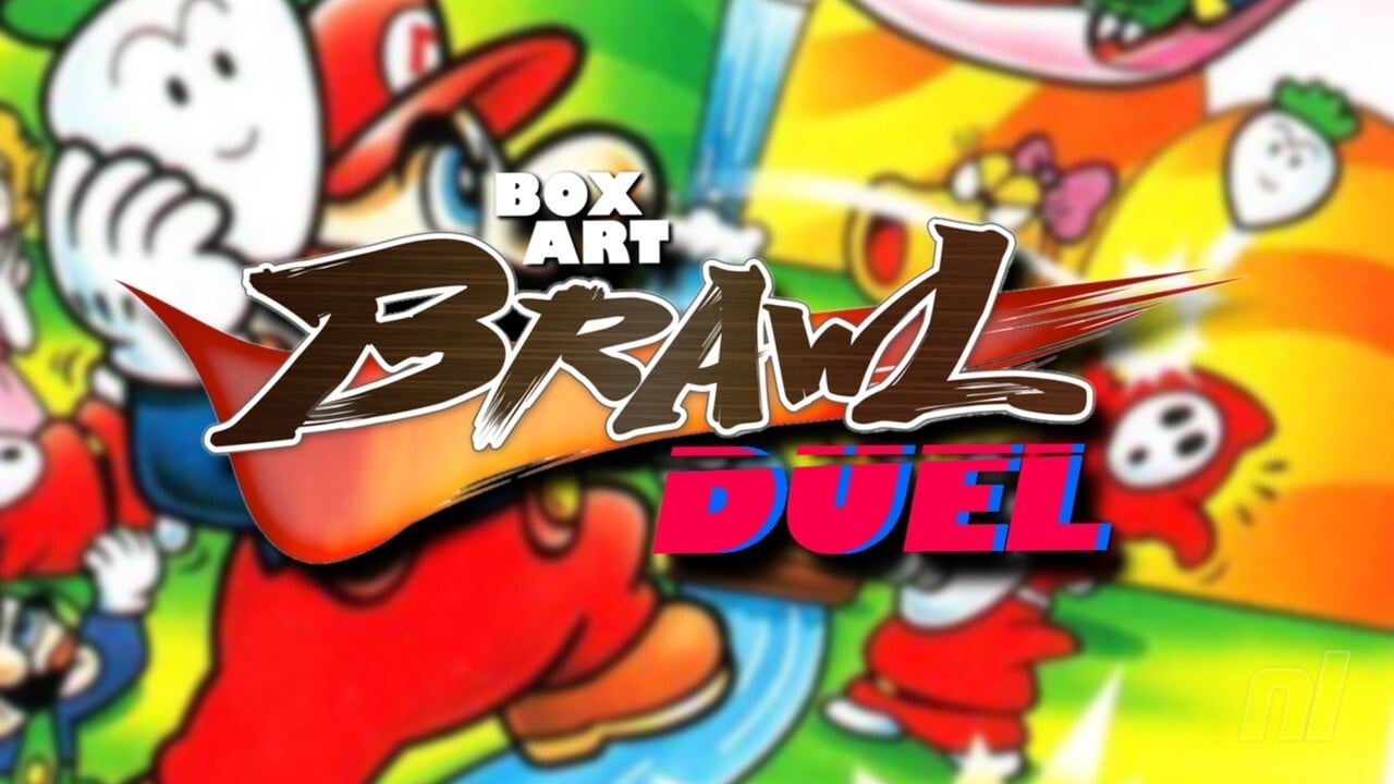
The Japanese design for Super Mario USA is a bit more laborious in its composition, showing Mario about to throw a shoot at a host of enemies that await him. We also have Luigi, Princess Peach and the frog in the background, so it’s a really nice little gathering of all our favorite Mario characters. We also have to admit that we are really taken with the pink surrounding the artwork. It is nice!
Thanks for voting! See you next time for another round of Box Art Brawl.

