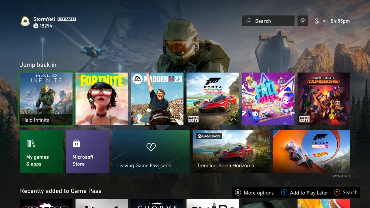
Simplicity was one of the things I loved most about the first version of the Xbox One interface. big fan of Windows Phone and Windows 8 Metro style; so when they brought it to Microsoft consoles, the truth is, I fell in love instantly. It’s something that has been lost, yes it’s true that the interface needed modernizing, but currently it’s mostly overloaded with stuff.
Those of Redmond wanted to put so many things at hand on the first screen that they really succeeded in the opposite. Of course, that’s my personal opinion and there’s always going to be someone out there who loves having all the Game Pass pins, ads, and tiles blowing up your wallpaper.
There will be changes to the house to make it less “cluttered”
It’s curious that the fan-made designs that went viral the most were the ones that stripped the interface of unnecessary buttons and elements and went back to simple. In fact, there weren’t a few complaints after the April update because, again, it shrinks space and takes away the prominence of the wallpaper.
Microsoft has taken up the gauntlet and has already declared that it is ready to make changes requested by the community. I’m surprised it took them so long to realize we didn’t want a cluttered interface. Obviously, it will be some time before that happens, and it will happen to Insiders first.
Here are the words of the company:
You told us that the changes to the top of the homepage didn’t leave enough room for you to enjoy your wallpapers and that they were cluttered. We strive to balance experience, accessibility, function and the needs of our community and provide you with a great and renewed experience at home.
As always, we’ll let you know as soon as there’s any news, although I don’t expect that in the short/medium term.


