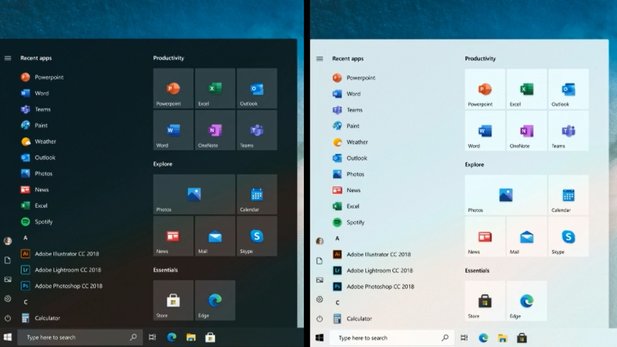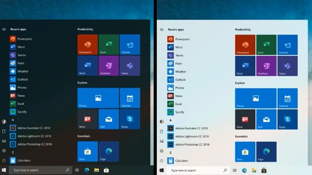
The start menu is the central point of contact for Windows 10Microsoft is usually reluctant to make changes to it. Visually, however, a major revision could soon be pending, as developers have shown in a podcast for Windows insiders (via PC World).
Icon designer Mike LaJoie describes the goals of the redesign as follows:
"The idea is to standardize the start menu, from a somewhat chaotic color scheme to a more uniform look."
How does Microsoft want to ensure a more uniform look?
- The large tiles in the right-hand area have a uniform, transparent background instead of changing colors
- In the alphabetically sorted program list in the left area, the tile look disappears with different background colors and gives way to classic icons

Disruptive factor live tile
An element of the start menu for which there is still no complete clarity for the revised version are Live tileswhich, for example, show current news, the weather or images saved on the PC.
Due to the changing content, they bring a little unrest to the start menu, but Microsoft does not want to delete them completely. Brandon LeBlanc from the insider program says "Anyone who currently uses Live Tiles will still be able to do so in the future".
When does the new start menu come? According to Computerbase, the decision for or against the introduction of the revised start menu depends on its acceptance in the context of the dual-screen operating system Windows 10X. So it could be a while before it becomes part of the standard version of Windows 10.
The revision is also related to Microsoft's "Fluent Design" approach. Among other things, it should provide a common, recognizable look for all Microsoft products such as Windows 10 or the MS Office Suite with new icons.


