

We’ve been playing The Legend of Zelda: Echoes of Wisdom pretty consistently over the past week, and it’s safe to say we’re really loving it. Sure, the frames per second could be improved (not that everyone minds) and the lock-on can be a little wonky, but overall it’s a very good time and a good return to top-down Zelda.
However, there is one problem that we have encountered time and time again. The one thorn in the side of roses that makes every part of the adventure seem like more work than it should be. We’re talking about that damn Echo selection menu.
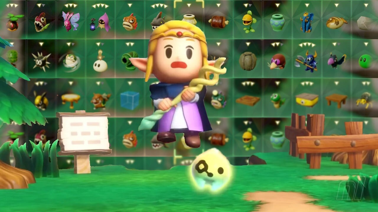
You know the one. Whenever you want to select Echo else but the one you’re currently holding (usually a bed, we’re not gonna lie), you have to hold right on the d-pad and scroll through a row of options until you find what you’re looking for.
At first, it’s not so bad. With only a handful of Echoes under your belt, selection is a breeze and you’ll have your Table, Spear Moblin, or Pot selected in no time. But as the options pile up (and boy do they pile up), so does the pain of searching for what you’re looking for.

There are several filter options — Recently Used, Most Used, Last Seen, Price, and Type — to help narrow down your search, but even after choosing the right order, we still find that it usually takes too long to stumble upon the Echo we’re looking for.
It’s of course a hangover from Tears of the Kingdom, a game that used an almost identical system for choosing Fuse items, but it all makes for a slightly bigger annoyance in Echoes of Wisdom.
While not ideal, it was very possible to go long stretches in TOTK without opening the select menu, continuing with the game as usual. But no such option is available in Echoes of Wisdom. Puzzles, combat and even navigation are built around the summoning system and while the ‘Most Used’ tab is handy enough when we’re out and about, it’s usually only a matter of time before we’re frantically scrolling to find that one monster we picked up four hours ago and I haven’t had a chance to use them yet.
What makes it even more frustrating is that we can think of several different ways that the select menu could be improved. The simplest approach that comes to mind is a few more menu lines. That screen is big enough to cram a few more options onto it, and being able to bypass 10 useless items by simply swiping down would definitely make things a little faster.
What about an additional ‘Favorites’ tab, where you can select several echoes to appear in their own row? We could even go crazy and bend that line into a circle à la Animal Crossing: New Horizons’ tool selection. That’s right, you have all the tools you need for your chosen location (say, in a dungeon) and you don’t have to navigate through rows of pots to get to them.
Perhaps specific groups of items could be mapped to specific buttons, so you can switch between recent ones on the fly. Or a separate upgrade could let us choose default options for combat, exploration, and puzzles, similar to TOTK’s Autobuild. We’re not saying these ideas are pure gold; we’re simply pointing out that the one-line selection menu quickly feels out of place — especially when those Echo options start to expand into the hundreds.
But what do you think? Would you like to solve your Echoes of Wisdom menu problem with any of our solutions or do you have your own? Maybe you don’t mind it at all and we’re just picky! You can share your opinion with us in the following survey.
Any other ideas? Be sure to let us know in the comments.