Apple Vision Pro is clearly a first generation product. Expensive, imperfect, limited and impressive. Much of what it needs to truly become a consumer device will require new, lighter, more affordable, and more feature-rich hardware. But that doesn’t mean Apple should just aim for its next big move at Apple Vision Air or Apple Vision Pro 2. There are so many software changes that would make this a much better overall product, some of which can be done in In the coming weeks or months, others may need to be part of visionOS 2.
Apple has already released visionOS 1.1, but its improvements are minor at best and don’t address some of the biggest issues and missed opportunities with Apple’s new headset. Here are some of the software improvements that we think should be at the top of Apple’s list to improve current Apple Vision Pro; no new hardware required.
follow the leader
When you open a Vision Pro app (other than fully immersive apps), it appears with a small window bar at the bottom with a “Close” button next to it. This floating window stays in place wherever you place it: you move, it stays in place.
While locking apps in the environment around you is awesome and sometimes useful, there are times when it’s very annoying. It should be possible to lock an app to the user, holding the app in position relative to the Apple Vision Pro hardware. Maybe we could pinch the window bar twice or have a lock icon on the right side of it. I would use such a feature every day. There are some apps that I just want to move with me.
Capture the Greatness
When you press the top button on a Vision Pro, you launch the Capture app to record spatial videos and photos. These are limited in resolution, just like when you record one with the iPhone 15 Pro. There’s a lot going on with recording and capturing these images, so the resolution limit makes sense.
But why flat screenshots and recordings limited to a resolution of only 1920×1080? This completely underestimates the exceptional resolution of the Vision Pro display and makes it difficult to share interesting experiences on social feeds in all their glory.

Foundry
Nothing better than being at home
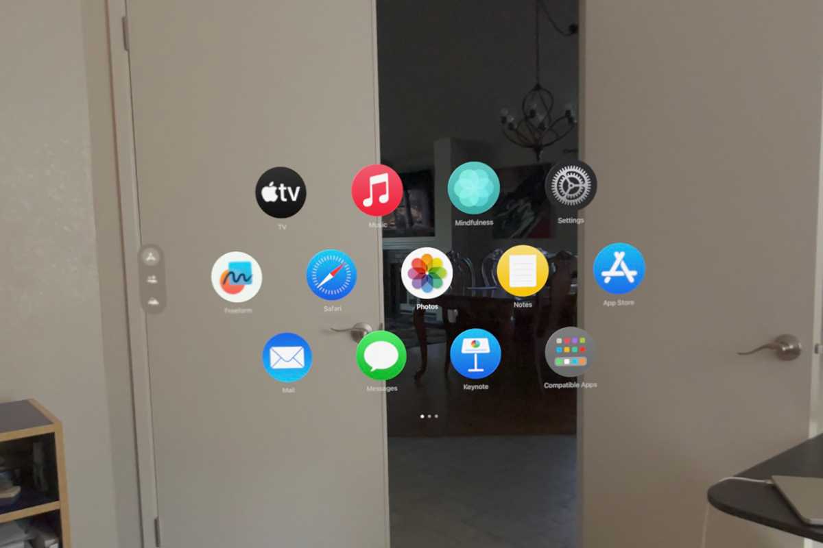
The Home view presents apps in a sort of honeycomb grid with four apps on the top row, five in the middle, and four at the bottom. The first page contains all Apple apps, with a folder for all “compatible apps” (iPad and iPhone apps) from any vendor. Then, page 2 continues with some Apple apps before listing all your other apps in alphabetical order.
It’s kind of a mess. I’m not a fan of the app library categories on iPhone, but at least there’s some sense of organization. We need a better home view with the ability to customize the layout of our apps, folders and more. The only reason this isn’t a bigger problem is because there are so few Vision Pro apps currently.
And how come this is the only Apple product (other than Apple watchOS 10 watches) that doesn’t have a Dock?
Share and share alike
Even if I’m in the same room as someone else with an Apple Vision Pro, we can’t see the same virtual objects. We cannot share windows. There is no virtual whiteboard that we can both walk and draw on. We might as well be in different parts of the globe. You should be able to share a “space” with someone else in your same physical environment, if both parties agree, and share fully immersive environments and/or objects with remote users.
It’s such an obvious omission that one wonders if Apple is actually working hard on such a feature but simply didn’t have it ready to launch. I hope it will be ready for fall.
Heads up!
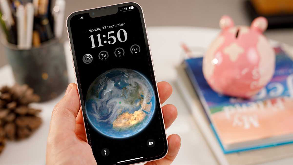
Just as it is useful for my iPhone’s always-on screen to display simple widget information, the Vision Pro would benefit from being able to display simple information in my iPhone. see always. Time and date would be an easy thing, but copying the iPhone lock screen widgets frame so I can pin some useful information to the top of my view seems like a no-brainer and easy for developers.
As with iPhone lock screen widgets, they should be limited in number and size and use only white with transparency so that the operating system can keep them readable (and make them disappear if necessary) .

Lewis Painter / Foundry
The gang is all here
Let me watch streaming video in a virtual cinema with my friends, which may be on the other side of the country. I don’t even need to see a “complete Persona”, I just want to see something sit next to me and chat by voice while we watch the same movie together. Vision Pro supports SharePlay, which lets you face someone while you watch or listen to the same thing together, but that’s not the same as having them walk around in the same immersive environment with you .
The same goes for any other type of shared experience in real time. Multiplayer games, for example. If I play Fruit Ninja, maybe another player can load the fruit launcher with fruits that come down on a conveyor belt, trying to provide more power-ups and fewer bombs. As it stands, each Vision Pro experience is solitary, except for FaceTime, which isn’t that different from the iPhone app.
Connect devices
It’s weird to me that the Vision Pro doesn’t really work with anything other than AirPods. Sure, your messages and photos are synced to the cloud, but there’s no notification when a call comes in on your iPhone, for example. Why can’t I take the call on Vision Pro like I can on my Mac?
Why doesn’t it do anything at all with the Apple Watch? How come I can create a cool virtual display for my Mac by just glancing at “connect”, but I can’t do the same thing with my iPhone or iPad? Using Apple Vision Pro not only makes you feel disconnected from other people, but also from your other Apple devices, with the notable exception of creating a virtual Mac screen.
Bridging the gap between apps
Fitness+, Health, Calculator, Apple Store, Find My… so many important Apple apps are not available on Vision Pro at all, even in their iPad form. Others, like Apple Music Classical, Books, Podcasts, Maps, and Clock, only have their iPad versions. We need real space versions of all major Apple apps.

Foundry
Embrace space
While the TV+ and Keynote apps have excellent “spatial computing” features, many others are little more than glorified iPad apps, completely devoid of useful or fun spatial features.
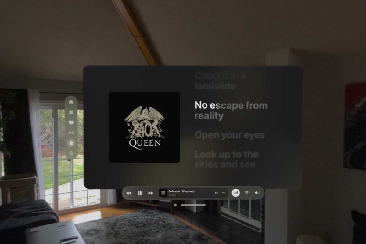
Why doesn’t Apple Music support “Sing” karaoke mode like it does on other platforms, with an immersive virtual karaoke room or bar to play in? Why doesn’t the Clock app let me set timers and pin them to items in my environment, with audio and visual spatial cues redirecting me to them when they go off? Or even just a few realistic-looking clock objects to select from and pin to the wall, with realistic animations and sounds when the alarms go off?
How about a Health app that syncs with my Apple Watch to display my heart rate as a real 3D heartbeat? Fitness+ where fitness instruction appears virtually to show me how to do yoga moves correctly? Why isn’t there an Apple Music Classical app that lets you listen to music in a virtual concert hall? Why can’t Books put a real virtual book in my hands? How about an Apple Store app that looks like the inside of a real Apple Store?
I had all these ideas in 10 minutes and Apple hasn’t built yet any of them of them again. Every Apple app should at minimum have spatial features that you simply can’t do with an iPhone or iPad app.
Stay on top of the latest Vision Pro news and update with our comprehensive guide.
Table of Contents


