MIUI 13 will be the next version of Xiaomi’s interface, which will be released for the brand’s phones before the end of the year. Only models launched in the last two years will be able to update to this version of the interface. A cape that should arrive soon.
In the absence of official confirmation from Xiaomi about MIUI 13 release dateWe already have the first image showing the interface of this customization layer. Specifically, it shows the renovated control center.
This is what MIUI 13 looks like
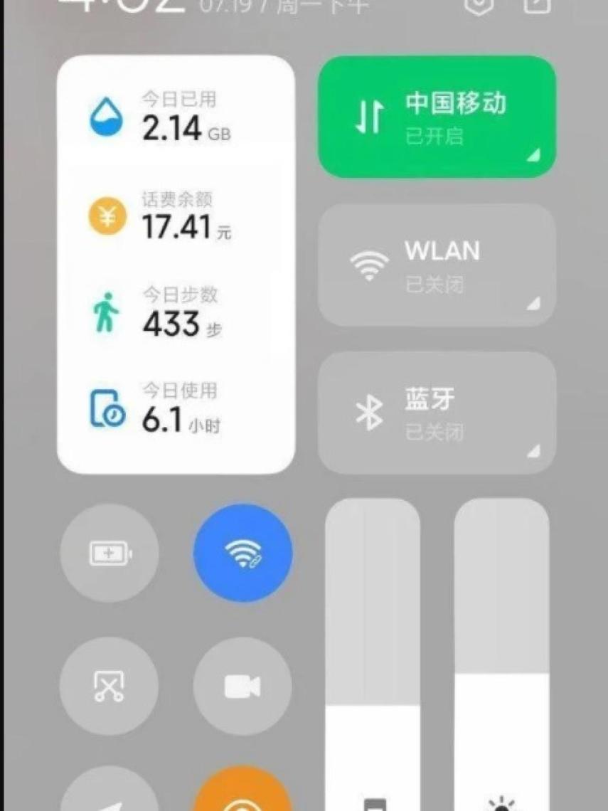
MIUI 13 Control Center
This first image that comes to us from MIUI 13 shows what it would be the new control center on the interface of Xiaomi phones. At first glance, you can see that the brand would introduce a much more minimalist design than what is currently found in MIUI 12 or MIUI 12.5.
The elements of this new control center are grouped into two columns. In addition, a new block is integrated there, it is there that one will be able to see the information concerning the number of steps, the hours of use or the financial report, for example. The rest of the items are the same as we currently have.
The design is more minimalistic and it looks like the style of the animations is also simpler. It is not known if this will be the trend in MIUI 13, where it will bet on a design that is a little simpler and with less elements on the screen.
It has not been possible to confirm for the moment whether this first image really corresponds to the control center that will be introduced in MIUI 13. Can be a montage, but at least it’s a good way to see some of the changes Xiaomi will be making to it.
it may interest you
Follow the topics that interest you
.

