Among the many new features of Android 13, there is one that you will probably use every day: the new media player that appears in the notifications menu.
[Spotify: probamos su streaming para ver todo lo que ha cambiado]
However, it is understandable that you have not seen it yet, even if you already have a mobile updated to Android 13. Indeed, the applications must be modified to support the new player. For example, YouTube Music is one of the apps that supports it, which is certainly no surprise.
Spotify and Android 13, union of luxury
Fortunately, little by little, other third-party apps are adapting to Android 13, and to date, Spotify is one of them. The music streaming service has updated its Android app to version 8.7.92.521, and the main new thing it brings is support for the latest version of the operating system.
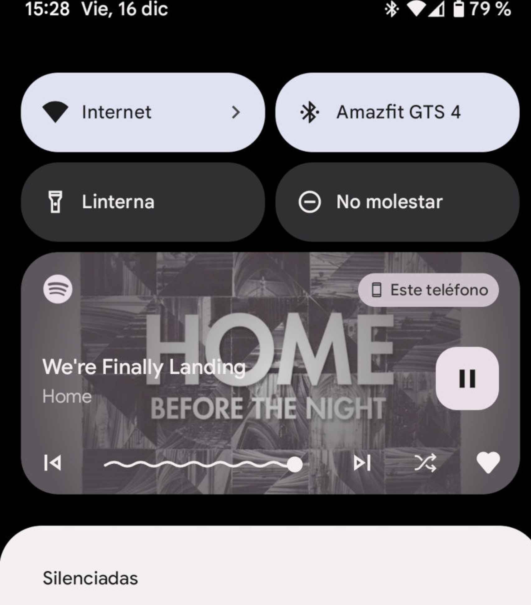
The new Android 13 player with Spotify
The free Android
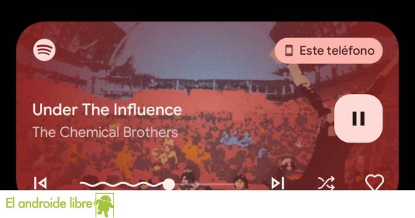
Android 13’s new media player is more attractive and functional than the one used in Android 12. The elements have changed places, and now it’s more intuitive than before. For starters, the controls are no longer all together in the lower right corner, but have different sizes and positions.
The big change is that the play and pause button is now bigger and therefore it is easier to pause the music we are listening to for a while. The playback bar is also larger, making it easier to find the specific point in the song we want; on both sides of the bar are the buttons for changing songs.
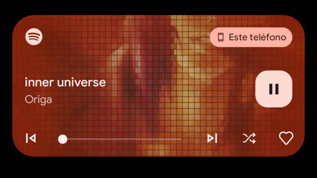
The new Android 13 player changes according to the song we play on Spotify
The free Android
As before, the player background is based on the album cover image we’re playing, and everything has a Material You layer, the visual style that’s normally based on the image we have behind background, but that in the player is based on this background image.
The only thing we have to do to use this player is update Spotify if we haven’t already. Just put any song and swipe down to open the Android notifications menu, and we’ll see the player, accessible from anywhere even if the Spotify app is in the background.

