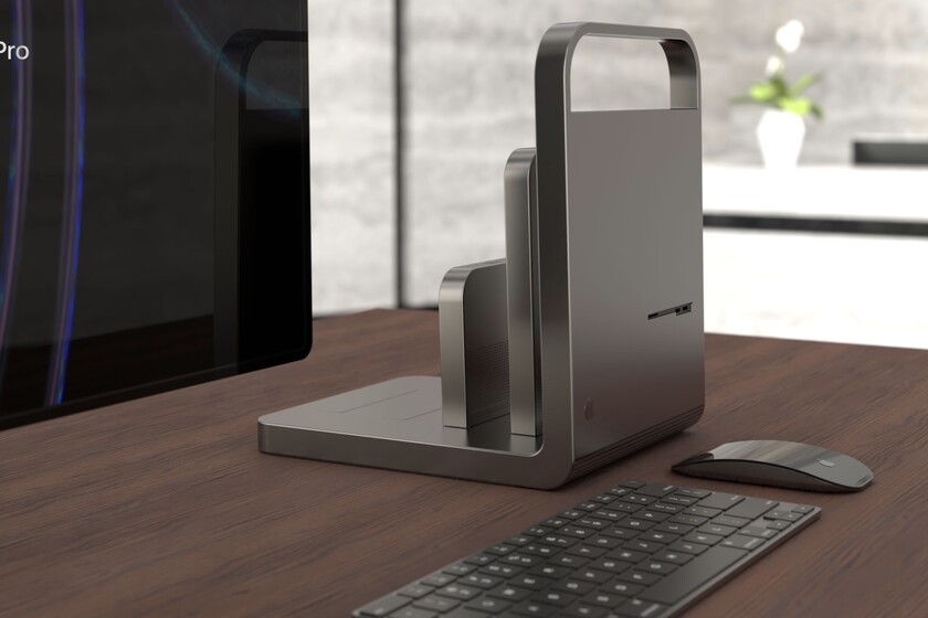
it’s always pretty let your imagination fly with concepts on new products. It is surely how many interesting devices have been imagined in the laboratories of Cupertino. Antonio de Rosa, a well-known designer, made a mockup of the new modular Mac Pro and it’s really “different”, without a doubt.
No ventilation: a facade, modular extensions and nothing else
As seen in the video above, the concept of this new Mac Pro boils down to an L which is the heart of the computer. With a facade clearly reminiscent of the first Macintosh
On the back, if not lacking it, the computer is sort of a flat surface with ports and connectors on the end. A configuration that allows the insertion of almost modular expansion cards like putting books on a shelf. Here, from a technical point of view, it would be necessary to speak of heat dissipation, which, although it leaves the work to the air of the room, it would be necessary to study well component by component.

Connection slots are properly installed protected by its cover and has a universal connector with which to insert into the computer. Here it would be possible to speculate that Apple sold an empty case, something like the hard drive case, where, for example, to house a certain graphics card and then connect it to the Mac Pro.
It is clear that this concept is not like the one that we will see this year or next year with the renewal of the Mac Pro. The truth is, we are waiting for a more conservative design, but on the other hand, it provides ideas and concepts. which are quite valid which can be well integrated into a more rectangular and regular design. This is for the fools, the …


