Related news
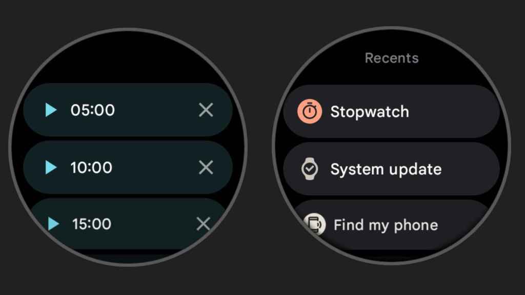
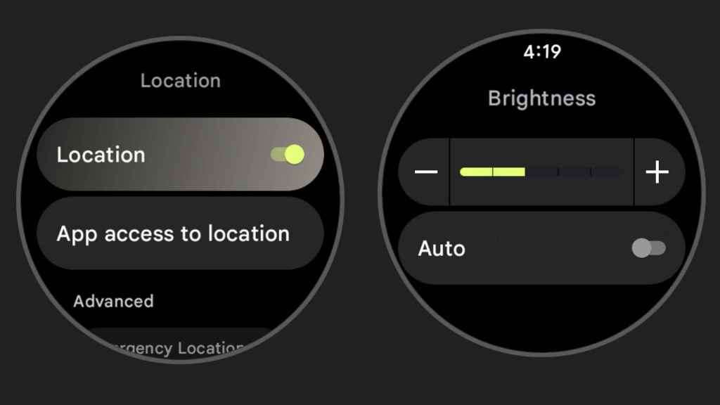
Wear OS 3 incorporates design innovations that so far have been little seen, and now a few screenshots are arriving that show the new design of the purest version of the operating system. In these you can see some changes, like the new rounded lines of the interface, in line with Material You, Google’s new design language for Android 12.
Here is Wear OS 3 in its AOSP version
Wear OS 3
Free Android
This version of the operating system has been present for months in some smartwatches, but under layers of customization that did not allow to see its original appearance designed by Google. This, as you can see in the screenshots, integrates some new views in Material You.
The first and most notable is the integration into the interface of more corners and curved finishes, which is very representative of Android 12.
Porting the OS 3 interface
Free Android
These have been incorporated into every possible section, from rows of items to different icons. These latter have also undergone a redesign, and now they have a touch of minimalism that fits in well with the rest of what the company has applied in the interface.
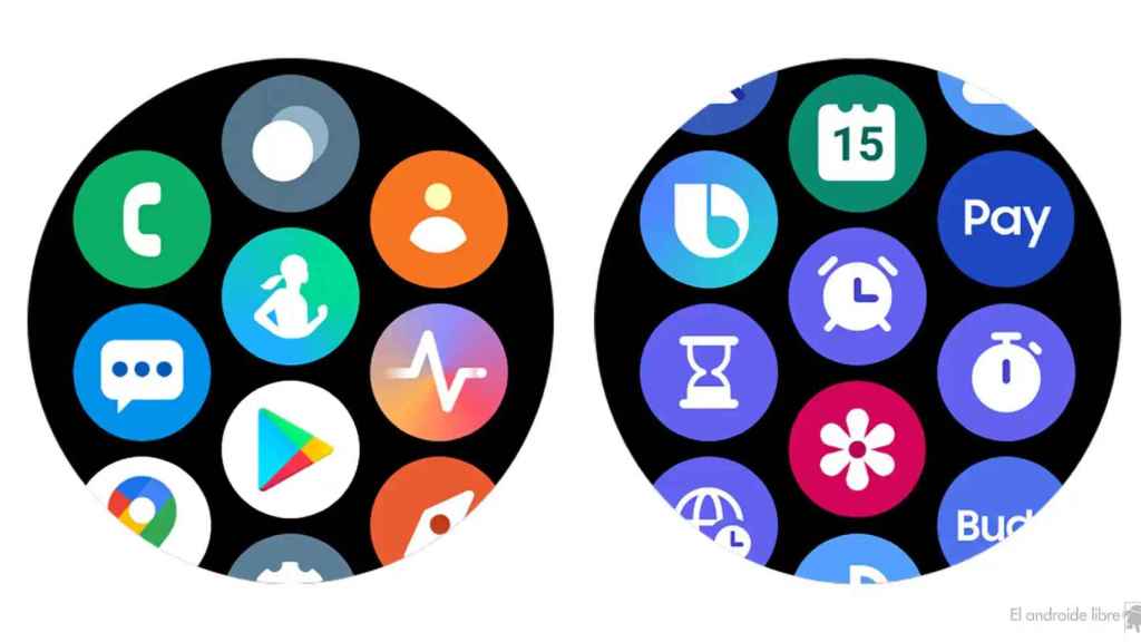
As you can see there are some differences with what Samsung showed in the Galaxy Watch 4 which uses this version, but also an interface that Samsung created to look more like One UI 4.
Wear OS 3 3n a Samsung watch
This version of the operating system will be phased out throughout 2022 for select compatible devices, so if your model is one of the compatible ones, you can take advantage of this new design. in a close future.
it may interest you
Follow the topics that interest you
.
Table of Contents

