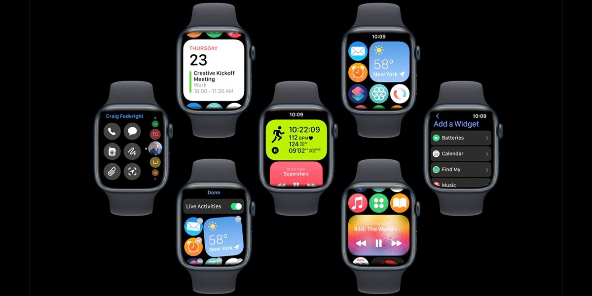
Yesterday we showed you a concept of iOS 17 where design changes were experimented with playing with the dynamic island of the latest iPhone. Design changes are expected for this new version of iOS but not as profound as those expected for watchOS. The latest leaks suggest that Apple may be working on deep design and UI changes that would happen with the release of watchOS 10. This concept home screen redesign of the Apple Watch with widgets moving away from what we have always known in watchOS.
A home screen facelift in watchOS 10
Parker Ortolani was responsible for posting this new concept model of watchOS 10 in his twitter account. The idea of releasing this concept is none other than the drift of rumors about a change to the watchOS user interface that we hope to have with watchOS 10. There really is no news, but there is speculation on a home screen redesign. with a change in the launch of applications and the arrival of live activities, among others. watchOS 10 will be released alongside iOS and iPadOS 17 at WWDC 2023 which will take place from June 5 to 9 of this year.


Related article:
watchOS 10 will bring a major overhaul to the Apple Watch interface
In the concept you can see above all Ortolani’s planned redesign of the watchOS home screen.
What if watchOS put less emphasis on launching apps and introduced a new, more customizable home screen with widgets and live activities, a new approach to looks and dock ideas… pic.twitter.com/EsSt5vOPQw
— Parker Ortolani (@ParkerOrtolani) April 9, 2023
In the video published in one of his tweets you can see how by scrolling we can take advantage of all the interactive information offered by the widgets. An example of this is the Live Activities which can be configured for each of the apps installed on the Apple Watch. This way of viewing the home screen does not take the user away from the spheres that it’s still the main view and would work as a “lock screen”, but what changes is access to the rest of the apps. Being able to take advantage of more information from other apps without having to type it. Will Apple have something like this concept in mind for watchOS 10?


