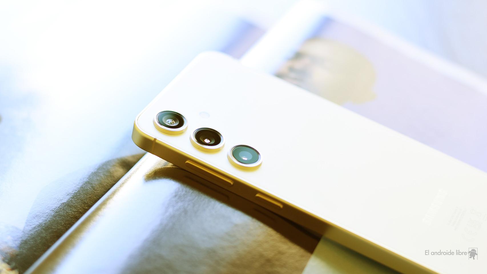
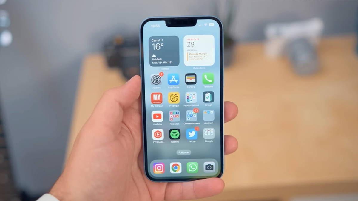
We have seen several rumors and supposed CAD design leaks that show that Apple is about to change the left side of your iPhone. Well, assuming you buy an iPhone 15 Pro. On high-end iPhones, the up and down buttons are replaced with a single volume button, and the mute switch we’ve had on iPhones since the beginning will now also be a button.
They will apparently be solid-state buttons that don’t actually push in. Much like the Touch ID modules on iPhone SE, the trackpads on MacBook, or the virtual buttons on the stems of AirPods Pro, these buttons will actually just be touch areas connected to the Taptic Engine haptics that mimic the feel of a click when pressed, even if nothing ever moves.
It’s an interesting new development, a curious little detail among more interesting new features, but I can’t quite figure it out Why Apple could do it. It doesn’t seem to fix any issues or enable any cool new features or functionality that aren’t possible today. And it might even introduce new problems.
Cost and durability
It’s tempting to think that the switch to solid-state buttons is about making the iPhone more durable. But the buttons aren’t the weak link that breaks iPhones — the glass on the front and back is.
Apple also doesn’t seem to have a problem making iPhones as waterproof as they need to be with the current button design. The Lightning port (or USB-C on the iPhone 15 Pro) is surely the limiting factor, as evidenced by the Apple Watch’s superior waterproofing while offering clickable buttons.
It also doesn’t look like it would be a cost-cutting measure. In fact, adding a touch sensor and Taptic Engine to the iPhone probably more than makes up for the cost of today’s traditional buttons. And the switch to solid-state buttons doesn’t seem to save any internal space – the current button mechanism is smaller than the smaller Taptic Engine would be.
Sure, it’s possible that Apple has some clever engineering solution that makes a solid-state design cheaper or smaller or both, but it’s hard to imagine that being the case. And if it did, you’d think it wouldn’t be just for the Pro model. So why is Apple making this change?

This button will not be a real button on the iPhone 15, but why?
Dominik Tomaszewski / Foundry
Advantages and disadvantages
When Apple switched to the Force Touch trackpad, the benefits were obvious. It was hard to click on the trackpad near the top edge where the hinge was, and Force Touch fixed that. It also allows you to easily “click” in multiple places and apply different levels of force.
With something as simple as the volume buttons and mute switch, it’s hard to think of scenarios enhanced by a Force Touch solution. A single volume button can be swiped for quicker volume adjustment, but it feels like a nightmare for those using a case (which most iPhone users are). It could detect different levels of force, but for what purpose?
Maybe Apple could do a quick tap, double tap, hard press, or something that triggers playback or accessibility controls, etc. But it’s doable with today’s buttons – it’s a software issue. Also, it’s a worrying idea, because without any visual indication that the volume button is doing anything else when pressed or tapped in a certain way, it’s going to be accidentally triggered by confused users all the time (like 3D Touch before Apple got rid of it).
It’s easier to see why replace the mute to change with a mute button might be desirable. Yes, you lose the ability to just glance at the side of your phone to visually confirm whether it’s muted or not, but the tiny mute switch is often a pain to manipulate. For those who use a case or have fine motor issues, a button will be much easier to manipulate than the current small switch. And how many of us have accidentally turned on our phone’s volume when taking it out of our pockets? I’m still not convinced it needs to be solid state, but a mute button would be an improvement.
It’s all in the software
I keep thinking about why Apple would make this hardware change. It’s not cheaper, doesn’t save internal space, doesn’t necessarily improve durability or waterproofing, and usability is kind of a “better in some ways, worse in others” situation. .
But then I remember Dynamic Island on iPhone 14 Pro. Before its official unveiling, we had reliable leaks that Apple was going to have a punch-hole style “pill” area for the Face ID sensors and a “hole” next to it for the front camera. There were all kinds of mockups showing what it would look like.
It was the software side that made it special. The “pill and the hole” was hidden behind an entirely new element that transformed a hardware problem into an interface solution. Since the hardware requires numerous parts suppliers and manufacturing partners, the physical aspects of a new iPhone often leak. The software, tightly controlled within the walls of Apple, is always a surprise. Hence the impact of the dynamic island.
Hopefully, a surprise similar to (if not as big as) Dynamic Island is exactly what Apple has in store for us with this new solid-state volume and mute design. Because if it’s just a touch and slide volume control, I wonder…Why ?


