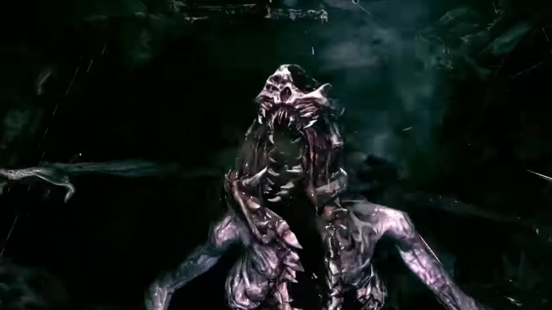
although Doom 4 Never technically released, a new concept teaser shows us what it might look like in motion.
Doom 4 eventually became Doom (2016), but it had a very different look early on (although don’t get me wrong, there was still a lot of rips and tears). But recently, id Software video editor and media artist Danny Keys featured a video on his Artstation page, although the page has since been removed (thanks PC Gamer).That’s okay though, because video game archivist Gman’s Archives has since shared a video
In case you don’t know, Doom 4 has been in development for a long time. Doom 3 was released in 2004, and id Software wasn’t sure how to make a sequel, which Noclip discussed in his documentary about the series. There’s no doubt that Doom 4 looks bloody, fleshy, and gory like any other game, but its tone from the 2012 iteration looks set to be darker.
Aesthetically, it looks more like Dead Space than any other game, and it’s a far cry from the colorful, critically acclaimed 2016 release. Apparently it was designed with the PS3/Xbox 360 in mind from 2012, and games in it were severely lacking in color overall, often looking muddy compared to the brighter tones of previous console generations. In terms of gameplay, though, you can see some similarities to its later days.
It’s pretty cool to see this version of Doom 4 that never flourished, if only for the sake of history, so hopefully we’ll see more of it someday.


