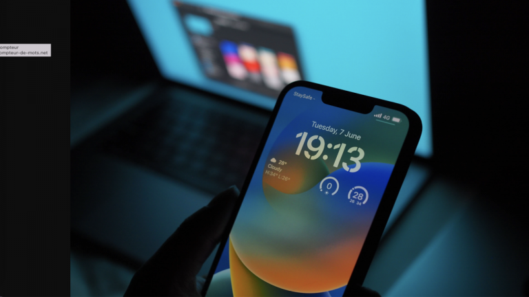
news hardware New iOS 16 update: we couldn’t believe it anymore, this feature is finally back on iPhone!
Beta 5 of iOS 16 has just arrived and here is the list of more or less important new features to remember. We’re focusing on one in particular, and we missed it.
Some minor additions and changes
Two types of iOS 16 betas have been floating around for the past few weeks. For the average person, we’re at Public Beta 2, but developers and other tech fans got into it long before that, and Developer Beta 5 has just arrived. here are the few minor additions, a non-exhaustive list.
- and new different and louder sound if you want to ring lost iPhone with the Find My app. See 9to5mac listen.
- On the music player on the lock screen, we now have a small one Audio frequency animation that moves with sound. Why not.
- When taking a screenshot, we can do it with a new option Copy the image and delete it at the same time.
- In Apple Music, the Dolby Atmos and Lossless audio labels now appear more prominently below the song title and artist name.
Battery percentage is back on iPhone!
short quiz,
What is the simple yet very useful, even entirely logical, feature that iPhone 8 or iPhone SE owners have but not the iPhone 13?
You read it in the subtitle, it’s actually the battery percentage shown right on the status bar, that is, the information at the very top of the iPhone’s screen that we see all the time.
Ever since the iPhone X, the first notched smartphone to launch in 2017, Apple has seen fit to remove the number denoting remaining battery life to settle for a battery logo that’s draining, when using the battery.
Thus we get a very refined status bar, but it forces us to assess approximately the remaining battery or swipe to show the control center and see the exact percentage.

This change in design was understandable on early notched iPhones, as the notch took up almost the entire width and caused the status bar elements to be squashed to the sides. But since the arrival of the iPhone 13 and the first reduction in the size of the notch by 20% in width, the info at the top is now wider and able to breathe a little.
To play devil’s advocate, maybe there’s a world where the exact battery percentage displayed non-stop in front of our eyes would make us watch it often and get a little paranoid about our iPhone’s endurance, huh giving the impression that it discharges faster. meditate
Apple has left us languishing and here is finally the battery percentage arriving in version 5 of the iOS 16 beta. We’re hoping Tim Cook doesn’t give up on the idea after testing it, what a disappointment that would be.


