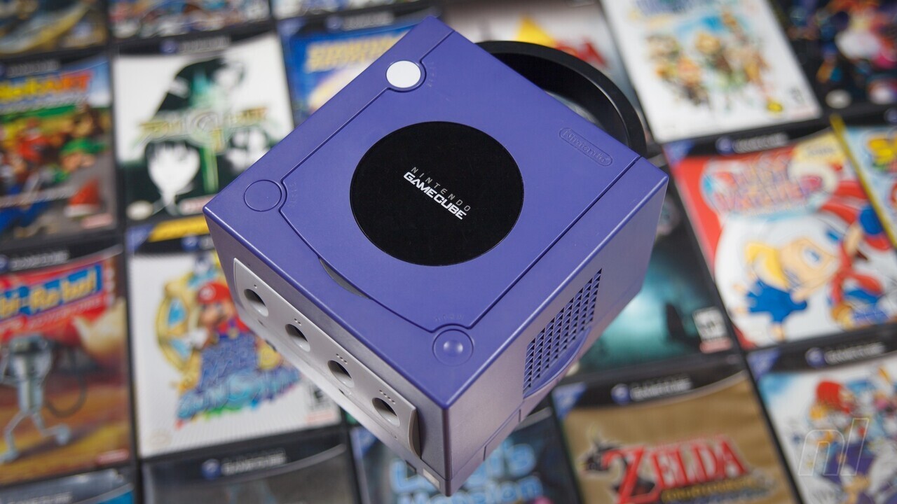
Xbox isn’t the only one celebrating 20 years this week. The GameCube – which ended up selling about 21 million units worldwide during its lifetime – is currently reliving its North American launch from two decades ago.
While purple might seem like a fitting theme for the system, prior to its launch in 2001, there were many doubts from within Nintendo. In an interview with our friends over at VGC, Nintendo’s former VP of marketing and corporate affairs Perrin Kaplan spoke about how the American branch advised against this colour in the beginning, due to concerns about “bad press”.
“We actually suggested that the purple was not the best to start with and [Japan] said, ‘no, we’re going to use that’. Then we pushed for black and silver, because I think in the US nobody had ever really done the purple colour before.”
“…It wasn’t that you couldn’t bring out hardware that was a different colour, it was just a very… ‘female’ looking colour. It just didn’t feel masculine, I think. I remember us being very nervous at E3 that we were going to get bad press purely based on the colour.”
Nintendo of America’s former director of corporate communications Beth Llewelyn recalls how the purple colour of its new home console only made the battle against Sony and Microsoft harder at the time.
“This pre-dates Apple. Picking your colour these days is like making a statement. But back then all the game systems were black… even white hadn’t really been done widely. Nintendo was never a technology story, but we were always combating what our competitors at Sony and Microsoft were doing from a PR perspective and having this purple box didn’t quite help there.”
Nintendo UK’s former marketing director Dawn Paige adds to this – noting how GameCube’s target market (which was the same audience as the Xbox and PlayStation 2 market) didn’t help the situation.
“With hindsight I don’t think we should’ve been trying to go after the same audience [as Xbox and PS2], going head-to-head against competitors who had squarely positioned 16-34-year-old products and who ours maybe didn’t chime as much with.”
“…Personally, I loved the GameCube, but even the look of it made some people perceive it more for kids than a wider appeal. If we could do it again, we would probably be less 16-34 and play to our strengths and gone after a more overtly family and kids audience.”
In the end, Nintendo offered a whole range of GameCube colours – with the main ones being Indigo, Jet Black, Spice Orange and Platinum Silver. There were also some other rarer colours like Pearl White and Starlight Gold.
Did you like the purple colour Nintendo used for the GameCube brand? How about the other colours it was made available in? Leave a comment down below.
.

