Welcome back to Box Art Brawl, our semi-regular retro box art poll to decide the best regional variants from two or more territories.
Last time went on an epic JRPG Dragon Quest in celebration of the series’ 35th anniversary. Following a spirited duel between North America and Japan, it was the caricatured beast from the East that eventually emerged victorious with a convincing 72% of the vote, leaving the Western wyvern to wing it away sharpish.
Today we look back on Battletoads, the NES game from Rareware that turned 30 on the 1st June. Come with us as we brawl our way through badguys and wrestle with brutal difficulty with Rash, Zitz and Pimple.
Grab your bike and let’s head into the turbo tunnel.
North America

It’s a classic cover — one which was also used in Europe — that captures the beat ’em up action of the game and features the three ‘toads kicking some serious tail. We like the slanted horizon line a lot, and the rich pinky-red terrain and glistening star field work well against the green and yellow of the toads.
Throw in a big bold logo and an epic icon in the top left corner, and there’s a lot to like here.
Japan

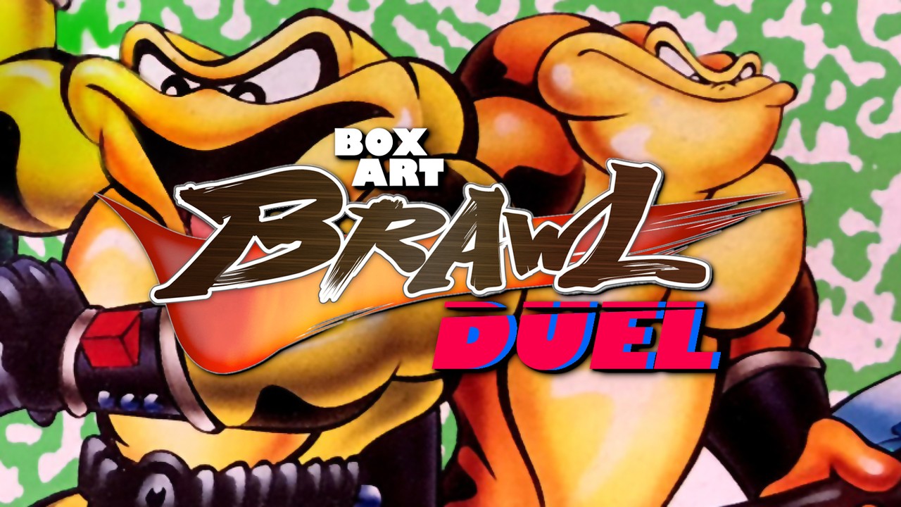
The Japanese Famicom box art gives the ‘toads recognisably different appearances but removes the background in favour of green blotches on white (or is it white blotches on green?).
We love that you get to see the personalities of the protagonists reflected here, and their slimy skins look great, too, but we’re not sure it’s worth sacrificing the background. The kickass chromed Battletoads icon is gone, too.
So, you’ve seen the options, but which way are you leaning? Click on your favourite below and hit ‘Vote’ to let us know:
Thanks for voting. Have an excellent week and we’ll catch you next time for another Box Art Brawl.
.

