Hello hello, and welcome to another edition of Box Art Brawl!
In last week’s fierce battle, we pitted the brutal, calculating, unsympathetic pink blob that is Kirby against… well, Kirby. The EU and Japanese box arts for Kirby’s Dream Land went head-to-head, and although the abstract nature of Japan’s box art gained a few fans, it was the EU’s more traditional approach that won the day, taking in 61% of the vote.
This week, we’re taking a look at another all-time classic with Super Castlevania IV. It’s the 35th anniversary of the original Castlevania on the NES in North America, and while we could have gone with that one for this week’s Box Art Brawl, we determined that the different regions’ box arts were simply too similar to one another. So what’s the next thing? Why, the re-imagining on SNES with Super Castlevania IV, of course!
It’s North America against Japan this week, and boy, are these box arts different. Take a good look at each one and make your voice heard. Don’t be a miserable little pile of secrets!
Be sure to cast your votes in the poll below; but first, let’s check out the box art designs themselves.
North America

The North American box art for Super Castlevania IV is quite simply iconic. Featuring Simon Belmont surrounded by creatures of the night, it’s said that Konami wanted the odds to be against the protagon ist in the key art in order to represent the advancements made by the game itself. We have to admit though, as with all SNES box arts in NA, we don’t like how the key art is shrunk down to make way for logos and other marketing bits and bobs. Not nice. Still, this is a beautiful piece of art work, and we absolutely love the classic logo!
Japan

♫ I’mmmm gonna swing from the chandelierrrrrr, from the chandeliERRRRRRRR ♫
Ahem… sorry.
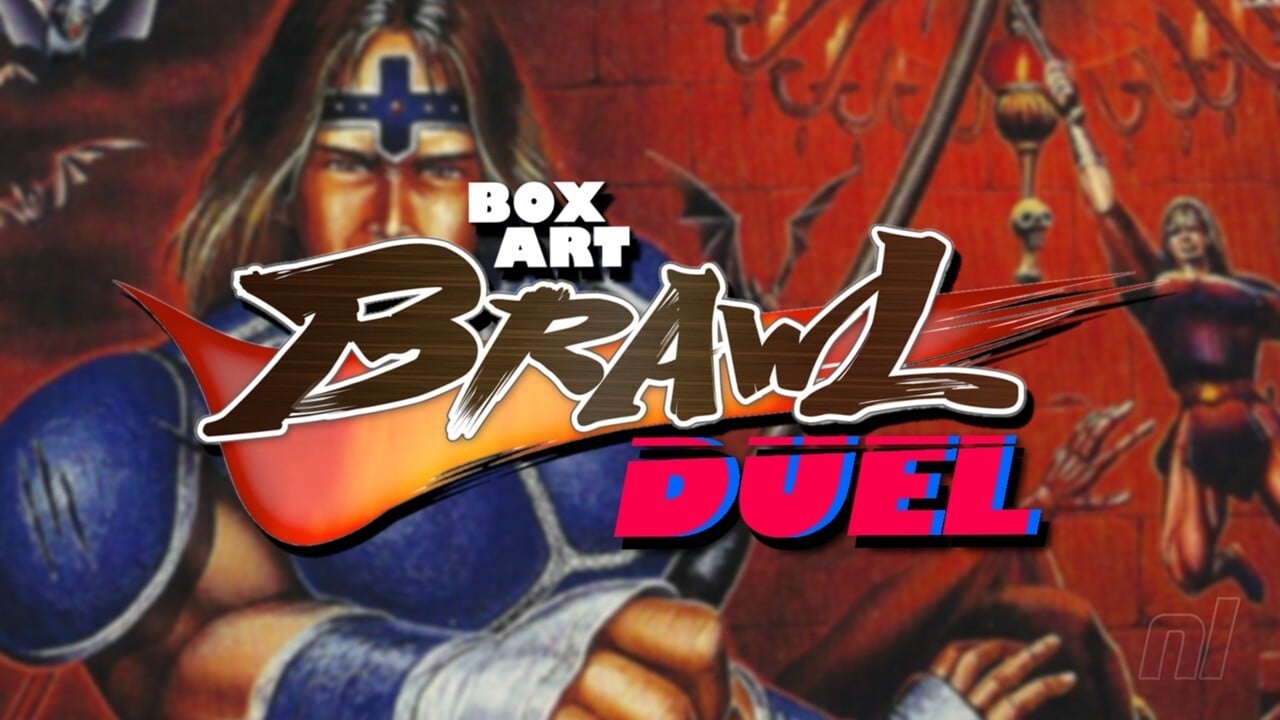
Japan’s box art is wild. Here, you’ve got a bunch of seemingly disparate elements of the game mashed up into one composition, including Simon in the foreground, Dracula himself at the far left, a bunch of bats flip-flopping around, and an image of Simon using his whip to swing across distances, a key gameplay element in the game. It’s a very busy piece of artwork, and if we’re being honest, the image of Simon in the foreground kinda reminds us of the disastrous North American box art for Mega Man… Not quite as ghastly, but still. Aside from this though, it’s a proper gothic piece that really demonstrates what Super Castlevania IV is all about.
Thanks for voting! We’ll see you next time for another round of the Box Art Brawl.


