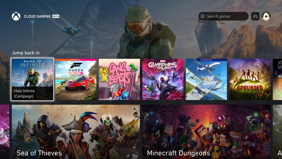
A few days ago, Microsoft announced a new interface change for Xbox. There are those who view the design change as a mistake, and there are those who like this oversimplification. Yes, it is true that the current interface may have too many elements on the screen which can divert attention from what is important, the games.
The fact is that so far we only had images, we needed to see what the new Xbox interface looks like in motion. And thankfully, thanks to user Gabor-117, we can start to appreciate the changes a little better.
The new Xbox interface foc uses on simplicity
Of course, it does not seem that this interface will leave anyone indifferent. The first images made it clear to us that they were keen to keep things simple, but we didn’t imagine that some of the customization had been lost along the way. At least that’s what the user in question says.
Nothing can be personalized. Like the home addition is gone and everything below is Game Pass, but I like that, I guess it’s good for people who don’t follow that much.
I just got the update pic.twitter.com/TFGmfAlIDa
— Gabor-117 (@ Gabor_117) September 9, 2022
This interface is open to changes, indeed Microsoft assured that it would listen to user feedback to work on the final version. The base feels solid and I personally like the look of it.


