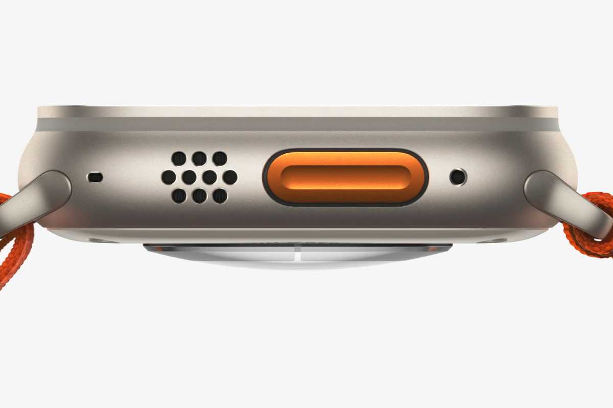
When Apple announced the Apple Watch Ultra, I was particularly interested in its introduction of an Action button, an additional piece of hardware that could be configured to trigger just about anything on watchOS. I started wondering if future regular Apple Watches might have their own action buttons as well.
Now I’m starting to wonder if the Action button could have been a sign of a major new Apple feature coming. What if the Action button came on… the iPhone? It sounds crazy, but it could happen as soon as this fall.
But first, the Apple Watch
Before you get excited about the possibilities of the iPhone here, I have to tell you the uncomfortable news about the Apple Watch Ultra’s Action button: it doesn’t live up to its potential.
This is because the Action button is not contextual. You can assign it to any number of different actions, but it behaves the same in all contexts. No matter what app or watch face you’re using, the Action button does one thing.

Apple
One of my hopes for the next edition of watchOS is that Apple makes the Action button contextual. For example, you could program it to be a single function globally, or maybe different applications could use it in different ways – let the user decide. Supporting double taps for different use cases would also help matters.
The trade-off between global and per-app commands is difficult. Just consider the Mac, where assigning global keyboard shortcuts in the Settings app can override keyboard shortcuts in individual apps, and vice versa. But giving Apple Watch apps direct access to a hardware button (I’m looking at you, stopwatch) would be amazing.
About Those iPhone Buttons
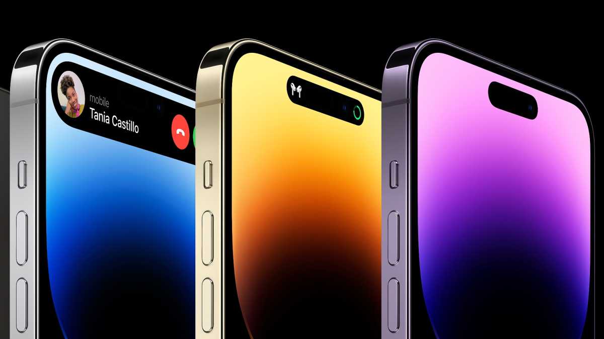
Now let’s move on to the iPhone. Rumor has it that Apple, in its ongoing effort to remove moving parts from its products, will replace the volume buttons on the side of the iPhone with pressure-sensitive “buttons”, much like it has done with the iPhone home button. 7. You pressed the buttons, but they didn’t move – there would just be a pulse from the haptic motor to indicate that you pressed.
The venerable ringer/silent switch, present on all iPhones since the original model, would also be replaced by a button. I assume it would work similar to the current Switch, where there is a specific vibration when you put the phone on silent. Or maybe there would be two different haptic vibrations, one for entering silent mode and one for exiting it.

Apple
But how many people use this switch? I leave my phone on mute most of the time. You can mute your phone from the control center. What if I could… do something else with this button?
You see what I mean.
My button, my actions
I want to thank Federico Viticci from MacStories for walking through the new button layout on the Connected Podcast. Once you consider the idea of Apple adding a button to the side of the iPhone, it’s hard not to be tempted by the idea that it should be reprogrammable. And wouldn’t this button be the equivalent of the Apple Watch’s Action button?
Consider the possibilities. At the very least, Apple could treat this button like the Apple Watch Ultra treats its button: as a trigger for a single global shortcut that would run wherever you are in the iPhone interface. Imagine mapping it to the Camera app or flashlight feature, for example.
It could be fun if apps had access to the button or if users could contextually control what it was doing. (I immediately started imagining that it would trigger a shortcut, which could then decide what to do based on my current Focus status, time of day, or some other variable.) But my best guess is that Apple will be conservative, at least initially, and make the new button mimic the ring/silent toggle – by default.
However, Apple has shown it’s happy to let users experiment with different ways of interacting with Apple’s hardware and software through the settings in the Accessibility section of the Settings app. It wouldn’t surprise me if Apple let users associate this button with another function through an accessibility setting, with options like toggling the flashlight, entering a specific accessibility mode, launching an app, or running a shortcut. And if running a shortcut is an option, then the sky is the limit.
Either way, I won’t miss the ringer/silent toggle switch. And I’m glad it can be replaced with a button that can actually be programmed to do something I want rather than being dedicated to a function I never use.


