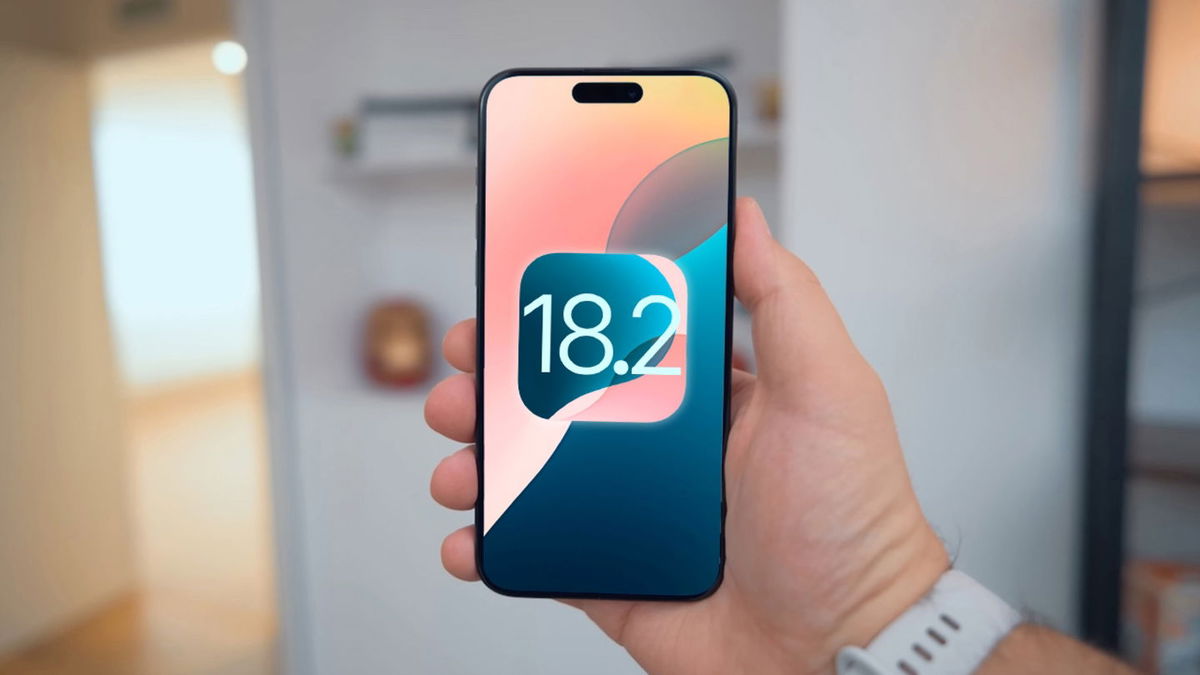
One of the novelties that most caught the eye of the new iPhone 14 and iOS 16 is the so-called Dynamic Island. Let’s say it’s like a Notch but supercharged. In this new concept, you can receive notifications and, even better, you can interact with them. For this reason, Apple has found a gold mine in this section and does not want it to become obsolete before its time. One of the ways of appearing that you have something new, but don’t have it, is through design change and that’s what Apple did with Dynamic Island in certain contexts. He changed his design.
Dynamic Island, this new concept Apple introduced in the iPhone 14 that helps us control various actions, but stands out from the others, the notifications. A new element that users have appreciated and which, theref ore, the company must take care of as much as possible. In fact, you have already started the improvement process. With the latest iOS 16.1 beta
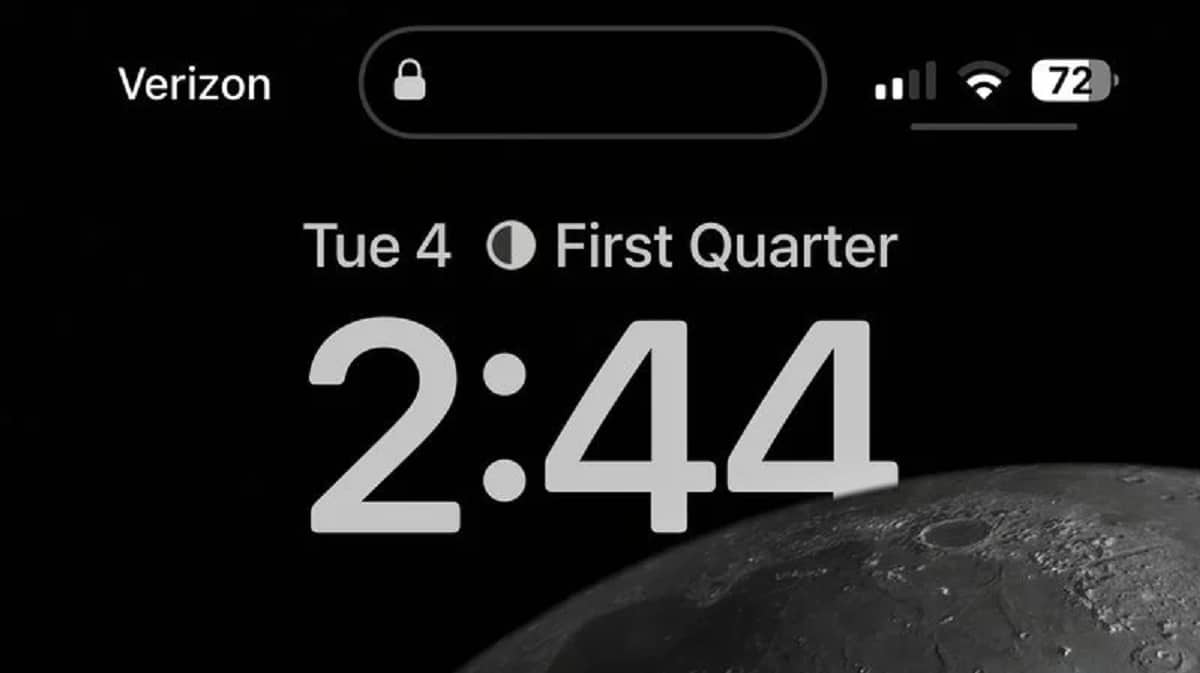
At the same time that a darker wallpaper is used or we have selected the dark mode option enabled, Added a light gray border around the dynamic island when the screen is darkened and when in use.

It should be clear that this attenuation, only occurs in a dark environment. On lighter colored wallpapers where the Dynamic Island outline is already visible, disappearing when the iPhone is unlocked or not in use, and reappearing when playing music or using an app that displays content, the border will revert to Appear.

