Related news
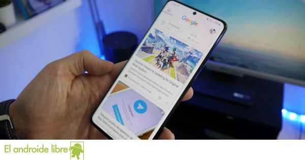
Google Discover has started showing its new design at the beginning of this month, as we have already told you. A simpler design based on Android 12 elements for this news feed, which is now starting to launch among users in Europe as well.
This is an update that is started on the server side and this already allows users in our country to have access to this new Google Discover design on their Android phones.
Here is the new design of Google Discover
Google Discover a new design
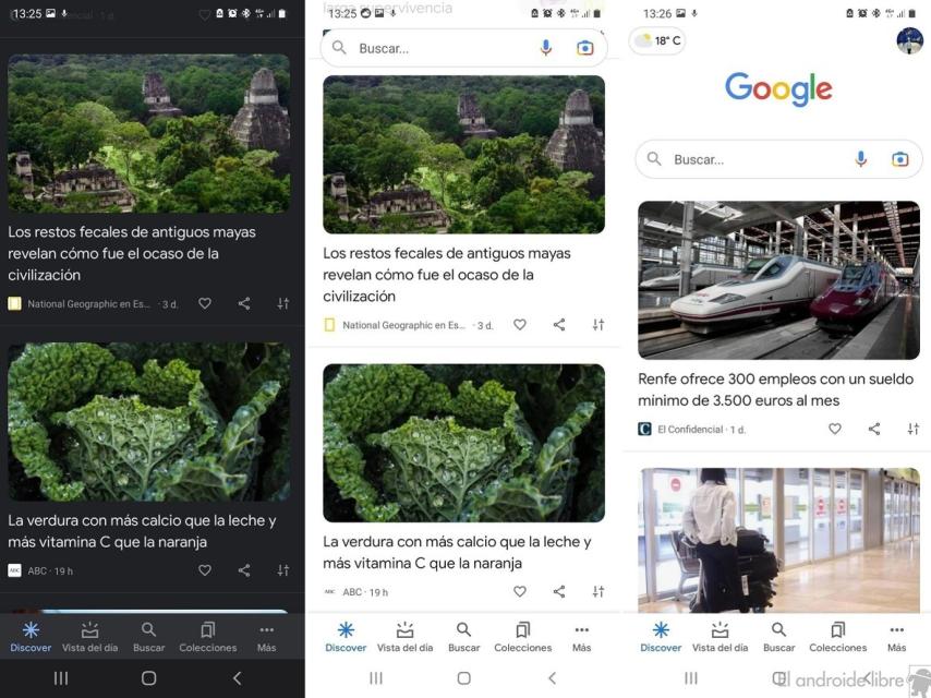
Google Discover’s new design shows a series of changes from the design this feed sported for a while. Some changes that we have already talked about in their time and which are starting to be shown also to users in Europe with this news feed on their phones.
Cards where the news was located are now deleted. In addition, only the photo and title of said article are displayed, along with the name of the media in question and the buttons at the bottom. A more minimalist design, which also saves space. Although the deletion of the first line of articles is still somewhat controversial.
Don’t show this first line this is something that may cause fewer users to open a Google Discover article on their phone. Although the simpler design allows for better navigation of this news feed on Android, which could help more users to use it.
This design it started to show already this month for some Android users, even those who did not have Android 12. It seems that it is already available in Europe, so it is possible that you already have access to this renewed design in Google Discover. The update is released on the server side, but check if the latest version is already installed.
it may interest you
Follow the topics that interest you
.
Table of Contents


