Last March, Google Lens was updated to add its own gallery to allow us to analyze photos on our mobile from the image recognition app itself without having to resort to Google Photos or the gallery. native to our mobile. Four months later, Google Lens improves your gallery in its new interface.
Google has started to activate a new design for Lens
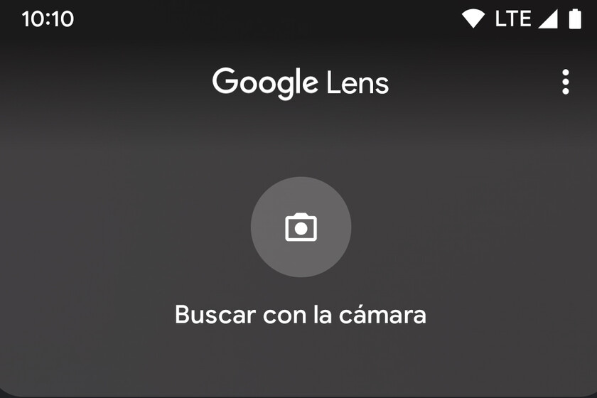
This is the new Google Lens
Before, as soon as Google Lens was on, the camera would be on and it would automatically start scanning everything it saw on the screen, showing a little direct access to the gallery. Now with the new design this is not the case.
As we see below, when activating Google Lens, a shortcut to activate “Search with camera” and some grids below will be displayed. In a 4×2 grid we will see the ** latest screenshots and just below another grid with all images

This means that if we want search with camera we have to press this option to activate real-time recognition, so with the new design we have to press one more button. However, with the old design, this required us to press twice to analyze an image in the gallery (one press to open the gallery and another press to open the image). Now with the new design with just one press or we search with the camera or we search in a picture.
Via | 9to5Google
In Engadget Android | Google Photos improves its integration with Google Lens: this is the new access to text tools


