Related News
Material You is Google’s new design language for Android, and after being introduced with Android 12, the company has taken it upon itself to bring it to its own apps to show an example of how to apply this new lines, as well as improve the design of it. Google Play has had its share of Material You before, but now the company updated it again to add new features
Google updates the design of Google Play again
New button design in Google Play
The free Android
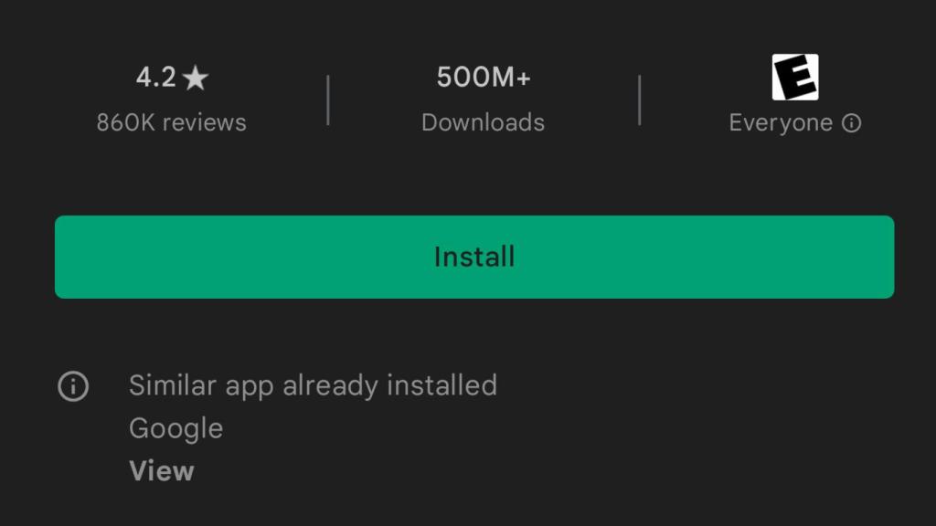
As already mentioned, Google Play I had already integrated Material You, but now the American company has decided to refine some details that make the design of the app a little more consistent.
Button with previous design in Google Play
The free Android
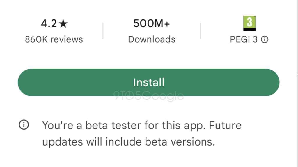
As reported by 9to5Google, the big change would be in the different types of buttons that appear in the application, such as the one to install or update, which would change from a rectangular shape with rounded corners to a curved shape,
New button with Material You
The free Android
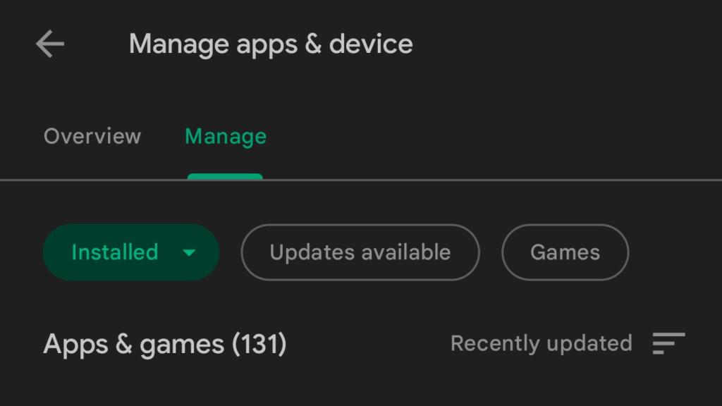
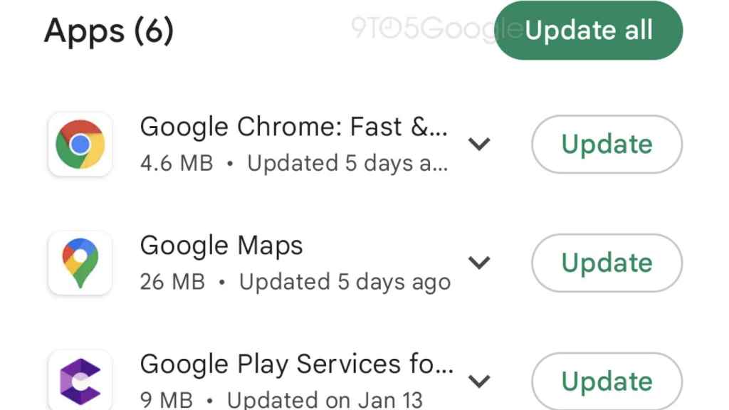
The other buttons that would change would be those for installed apps and available updates, which are found in the Manage applications section, and that they would have the same change as the previous ones.
Rounded Buttons on Google Play
The free Android
This new design has not yet reached users, so it is expected that it will coming soon in one of the future updates from the Android App Store, which at the moment it looks like it won’t receive the dynamic colors of Android 12.
You may be interested
Follow the topics that interest you
Table of Contents


