At the last developer conference, Apple introduced us to a new application. The one that entered a category that we had not seen until now in the catalog of the Cupertino company and that was totally focused on taking notes and organizing almost any type of project. And to do it in collaboration, of course.
Undoubtedly, the pandemic and telework have accelerated the use of remote sharing tools, such as the large canvases that are the basis of this new free apple app included in the latest version of their operating systems.
We’re talking about Freeform, an application that can already be used on iPhone, iPad and Mac thanks to the recent release of iOS 16.2, iPadOS 16.2 and macOS 13.1 and whose approach is really interesting. An application in which we can both structure the chapters of our memoirs and add graphic content or annotations, as well as plan a group trip or organize a project in the office.
A list of whiteboards, owned and shared
Freeform’s interface is really simple, which makes it easy to quickly Let’s find exactly what we’re looking for without feeling overwhelmed
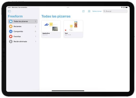
Initially, we started from a list of what Apple has called whiteboards. A list in the sidebar on iPad or Mac, but full screen on iPhone. Here we find all whiteboardsfinally recentthe ones we have share and our Favorites. Also a section for which we have just deleted.

This is where we keep all the whiteboards, both our own and those someone has shared with us. Some blackboards that can be seen both as an icon, with a larger preview, and as a list and can create by simply touching the pencil-shaped button on a sheet of paper.
A toolbar with a lot more options than it looks

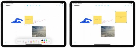
Once inside any table, we need to focus on the top sidebar. The first thing we find is the marking tools, which we access by touching the pencil icon. We can write or draw, both with our finger and with the Apple Pencil (and its floating pointer effect), like on any photo and we can also, using the small pot icon paint, highlight any section simply by sketching a box over it. A very useful function to highlight parts of a text or a concept map, for example.
The next one the bar tool is the post-it

Then we find the shapes tool, the same one we already know from Pages, for example. We can use it to add squares, circles, arrows and also geometries, objects, animals, nature elements, food, symbols, places, activities and much more. For each shape, in addition to its size, we can modify the color of the fill and the type, size and color of the line. We can also write inside the shape and vary the design of the text according to our needs.

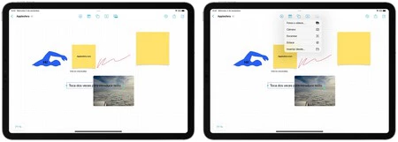
The text box tool It’s exactly what we’ve been waiting for, a way to input typed text where we can change the size, color, format, etc. And finally the content toolwith which we can insert elements like photos or videoscapture content with the Camera, To analyse document, add connections or use the insert from
Options to move and organize the content according to our needs

Once we have added different content to the table, you can move it, resize it, consult it (in the case of photos or PDF documents for example), delete it, duplicate it and several other options. Many of them are behind the three-dot button, which also allows us to bring an element to the foreground or background, cut it, lock it to prevent inadvertent changes, add a description for greater accessibility and even to decide if we want it to cast a shadow, round its corners or keep the proportion by moving it.
Moving around the board is as easy as zooming in or out with two fingers or dragging with one. We have a high zoom level (from 10% to 400%), so we need to have plenty of space to plan practically anything. A plan that we can then share both to invite others to contribute content or view it, and in PDF format to send it to whoever we consider.
After a few days of testing the app, the simplicity of Apple’s approach makes Freeform the closest thing to a physical blackboard or a corkboard to pin and organize content. If we add to this the possibility of collaborating with anyone, we have a truly versatile tool. Versatile both for organizing what to talk about in this article and for planning the development of our new application.
In Applesphere | This is what I love most about iOS 16.1: the iOS we saw at WWDC is here


