Related news
Google has made a very strong bet on Android 12 for the design, as we have seen in our analyzes. After several years of using Material Design, the company evolved design with Material You, one of the most radical changes since the birth of the system.
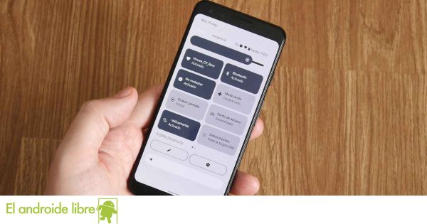
One of the biggest novelties of this interface is the possibility to change the colors of the system according to the photographs that we use as wallpapers.
However, the color choice is not always as successful as we would like, something we had already noticed and a developer, Danny Lin, decided to improve.
Improved Android 12 interface
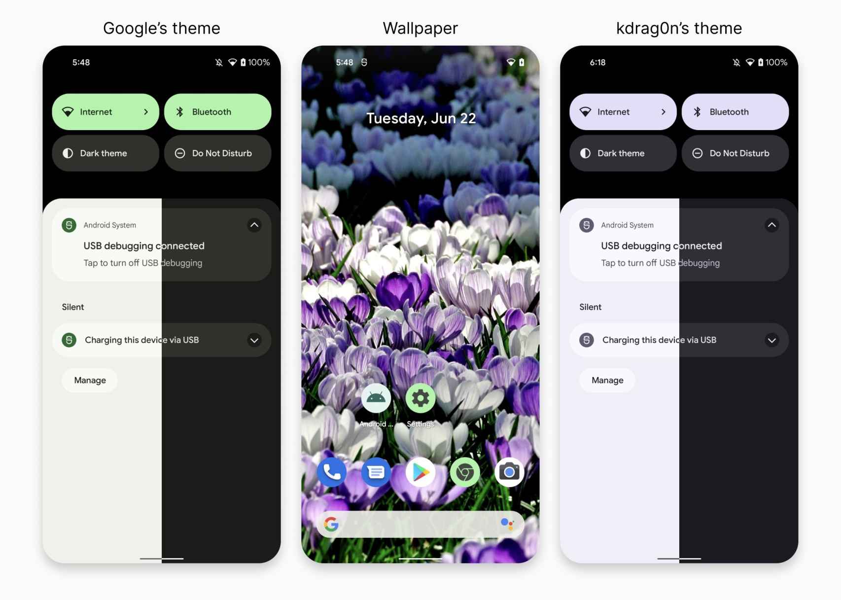
Colors according to Google (left) / Colors according to kdrag0n (right)
This programmer, known on Twitter as kdrag0n, posted on his pr ofile the results
As you can see from the images, the result of Danny’s engine color choice is more consistent than that of Google, which sometimes opts for less identifiable colors in the main image.
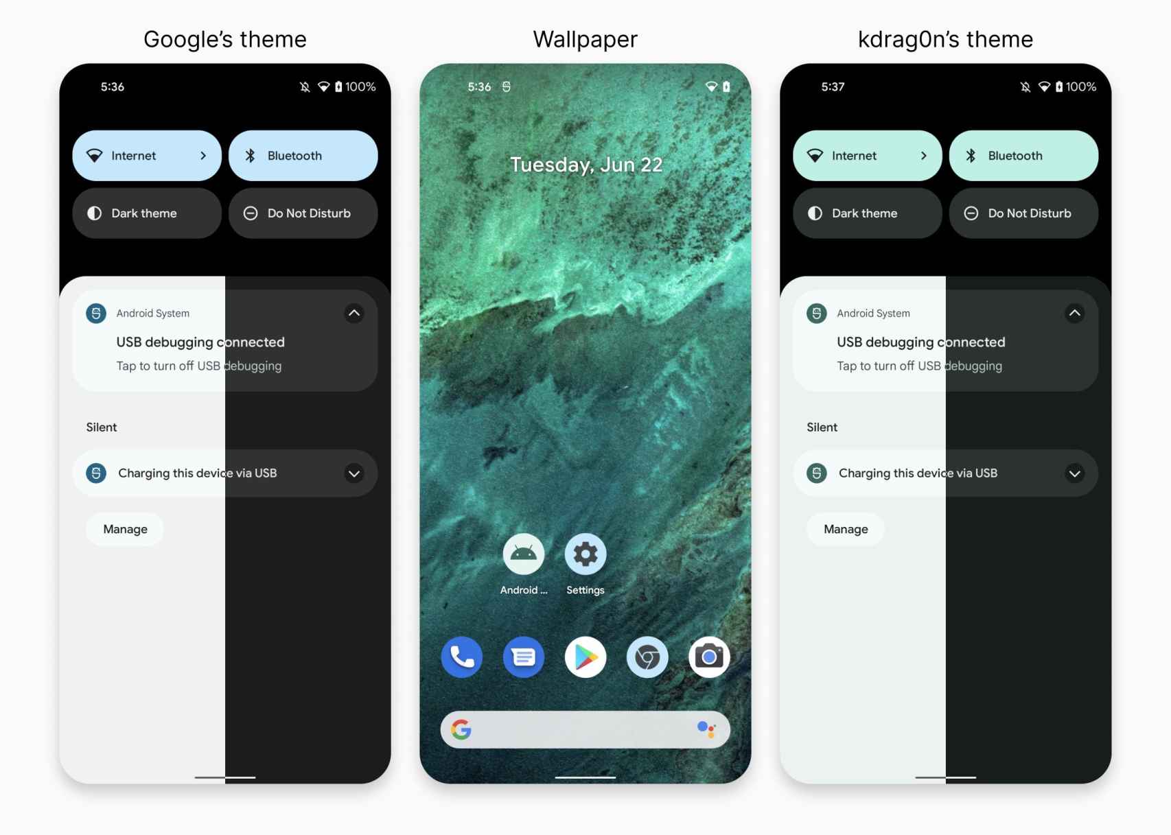
Colors according to Google (left) / Colors according to kdrag0n (right)
Sometimes the results are almost the same, but even then the developer’s choice of colors seems a bit more precise, although here it almost depends on the subjective choice of each individual.
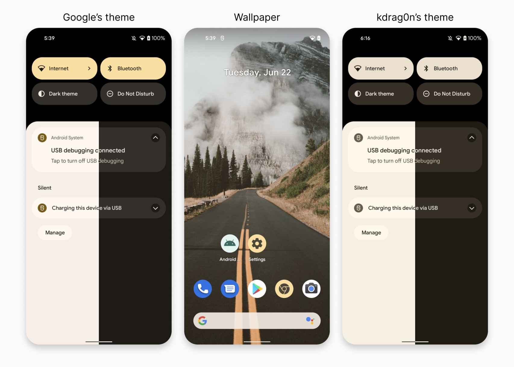
Colors according to Google (left) / Colors according to kdrag0n (right)
The color engine was created with an MIT license so that any Rom creator can use it in their development if they wish. Even a manufacturer could choose to use it instead of using Google’s.
Of course, we cannot lose sight of the fact that what we have seen so far from Android 12 are beta versions and the design and color choice could change in the final version or in one of the two. trial versions which have yet to be launched.
.