
In the comments of the various articles of Applesfera in which we talk about the notch, the positions for and against are still very different. The truth is, it is an element which, within the framework of design, enters the realm of personal taste. A delicate ground in which, however, I will enter to think about why I personally like the notch.
On iPhone I can see it well, on Mac even better
The first thing I have to say is that the iPhone notch I’ve always seen. From the iPhone X, which I liked to the iPhone 11 Pro and then to the iPhone 13 Pro, the notch seemed like a logical part to me. Logic because the interface is perfectly integrated. Since the top of the notch is designed, I feel like it’s not screen space I’m wasting, but more frame space I’m gaining.
This is truer than ever in the portrait orientation of the iPhone. In this orientation, only the permanent system menus are present, which leaves the rest of the space free for applications
Personally I don’t see a big problem with part of the screen being occupied during a game or movie in which the orientation is horizontal, but I admit that it is in this position where the integration between hardware and software is a little less.
The magic of the full screen menu bar

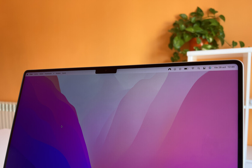
On the Mac, however, there is only one screen orientation, so the software integration around the physical element is excellent. I use almost all of my apps full screen, in this mode the notch is not, it is not visible, it has totally disappeared.
Finished even if we move the mouse to the top of the screen to “unfold” the menu bar. And I put the word display in quotes because, until now, when we went to the menu bar with a full screen application this bar is lowered from the top and resized, although slightly, the application. This was particularly noticeable in Safari, where the page shifted slightly to accommodate a new element on the screen.
As the menu bar appears and disappears while being in full screen, I don’t feel that the notch takes away screen space, on the contrary, I feel like I am saving space. ‘space from the same frame. pic.twitter.com/oIS2XFvOcZ
– David Bernal Raspall (@ david_br8) October 29, 2021
In the new MacBook Pro with notch, the situation is very different. When we have a full screen app and go to the menu bar, it “appears” at the top. The application is not resized, no element of the interface is moved, only the menu bar appears in white letters on what the frame can easily look like top of the Mac. And in this display, the notch is still completely inv isible.
I will say it very clearly: I love it. I’ve been enjoying the new 16in MacBook Pro for about a week now and am always amazed when I go to the menu bar and no resizing occurs. It’s such a smooth, natural transition. And, coming back to what I said above, it brings me to the same feeling: I gain space in the frame, I don’t lose a screen.
A matter of wallpapers

What if we no longer had a full screen? Here the situation is slightly different. First of all, it must be said that any wallpaper with a black top will not completely disappear the notch. Backgrounds that also look great thanks to the contrast of the mini-LED display.
If we use a colored background then yes, so the notch looks. Upset? Not personally. But I admit that this is the most personal part of all, so I won’t go any further in what is a matter of taste.
In the case of a long menu, the system avoids the notch. You can see it in the screenshot.
You simply assign a safe zone and distribute the menu around it. pic.twitter.com/Z5gvRZKKxN
– David Bernal Raspall (@ david_br8) 28 October 2021
What I can say is that on a practical level, the notch is never an obstacle when using the menus of the application. For these menus, as can be seen above these lines, the notch is simply a space that should not be occupied, nothing more. Clear and simple.
The last thing I want is to try to convince anyone of anything about the notch. What I want is to think about why I appreciate that Apple made the decision to bring the spectacular display of the new Macs to the physical edges of the device. Supporting me, in addition, in a week of daily use. In the end, and to finish as I started the article: I like the notch!