This year I decided to try Android as a personal mobile. Well, I don’t really have a personal mobile as such because the ones I use are the ones I have to analyze every moment, but let’s say that for the past two years I had an iPhone as a “support”.
This was where he had home automation, different accounts, this was the one he used as a hobby camera (and also for work) and ultimately he had an iPhone when he didn’t of Android to analyze. Now that has changed and my partner has the iPhone 14 Pro while I have a Vivo X80 Pro. It’s a mobile that I love, but I don’t have it because it comes from the factory, but with the Microsoft Launcher.
In my personal Android I can’t have the default launcher
In this case I will talk about Funtouch 13 (the Vivo personalization layer), but it is expandable to MIUI from Xiaomi, One UI from Samsung or Magic UI from Honor, among others. I would get used to the Android of the Pixel or the Nothing OS of the Nothing Phone (1) perfectly.
I don’t like manufacturers customization for my personal mobile. In an analysis terminal I don’t care at all and I know how to appreciate what each layer adds to the experience, but for my mobile I want something more “pure”.
Not to the extreme of iOS and the need to download transparent widgets to be able to sort icons by dashboard
The huge advantage of Android users are launchers. Basically, it’s like the manufacturer’s customization layer, but with more freedom in some cases, new features or major cosmetic changes. There are super popular layers (like the POCO, the Nothing Phone or the famous Nova Launcher), but others tend to go unnoticed.
There are many, many, and after spending two weeks testing launchers, I opted for the one from Microsoftt. It’s been two weeks and I’m thrilled with Microsoft Launcher – long live the originality of the name -.
It’s not s imple, on the contrary, but there are three elements that made me want to stay here and, after a month in this launcher, I feel at home.

Basic functionality like long presses on apps to unlock shortcuts isn’t lost.
First of all, once you download it from the play store – you have it on this link – you run the launcher as if it were a normal app and it will tell you if you want it select as default launcher. You accept and that’s it, you’ve just changed your mobile experience.
It is true that It’s not such a drastic change. like the one you can experience with Niagara Launcher (too minimalist for me), but it is still a launcher very different from the vision that Chinese companies have of the software.
But hey, I’m going to stop the literature and I’m going to tell you the three points that made me stay in Microsoft Launcher.

I am a Bing user, but also a Chrome user. I use Bing for my personal research and earn Microsoft Rewards points. I use Chrome with the same account I use on the desktop browser for work, so my work passwords are there and I can have a “hybrid” experience.
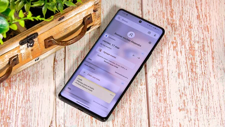
However, I want to have as few icons as possible on the dash and two browsers are redundant so i have chrome and if i swipe down a bar appears with recent apps, search for installed apps and also bing search. This is a very useful shortcut.

The second reason is that I have a widget area where traditionally Google Discover is on an Android mobile. I don’t mind that I lost Discover on my personal mobile because I already have it on the ones I scan, and so I can have the dash clearer.
can i put sticky notes synchronized with the Microsoft suite, as well as a calendar that synchronizes with Outlook, but also with those of Google. It is very useful and beautiful to have a design with transparencies. Well, you can place any other widgets you want, but I only use these two.

And the third reason, and the most powerful, is the hidden application bar. On my main screen, you can see that I have two rows of apps. They are few, but the trick is to scroll the second line.
This unlocks a third row with apps that I use every day, but open less of, and that way they’re less visible, but still accessible without having to go into the app drawer.

These are the main reasons, but I must also say that the navigation is very fluidI like the seamless design of the settings and app drawer itself and the fact that the launcher itself is highly customizable. Now, it’s far from perfect.
Be careful, it has a huge limitation (which in turn is its main advantage)
Aesthetically, I would have liked the notifications and shortcuts bar to retain that seamless design from the rest of the launcher. Instead, it’s the design that the Vivo layer uses, which isn’t bad, but to customize everything, Wish this was redesigned too.
Something I miss, and can’t enable, is the ability to switch between apps, simply by swiping your finger from side to side in the chin area of the terminal. The Vivo layer allows it, but not Microsoft Launcher and it’s a shame to have to use “traditional” multitasking (The one to swipe the bottom part to the center of the screen, hold for a second and see all open apps).
And the big limitation is that I work more with the Google suite than with the Microsoft suite. and widgets and some options are designed to be synchronized with Microsoft applications. Like I said, it affects me because I’m more Google in that sense, but that might not be a deal breaker for you, and in fact it might be a point in favor of the launcher.

Panoramic mode is a hoot, although it does come with layers of customization from manufacturers.
the final, this is a very personal matter because in design and functionality each person is a world, but after trying many launchers, I prefer the Microsoft one without thinking twice. It flies in the Vivo X80 Pro, it looks great in its design on a mobile with such a large and quality screen and that second app bar at the bottom is something that all mobiles should have in their layers of customization respective.
Now, I invite you to leave us in the comments if you are more of a third-party launcher or go all out with each builder’s customization layer.
In Xataka Android | The Best Launchers for Android: In-Depth Comparison
In Xataka Android | 19 Android Launchers We Recommend You Try in 2023
In Xataka Android | The confusing world of OLED screens: Types of organic panels you can have on your Android


