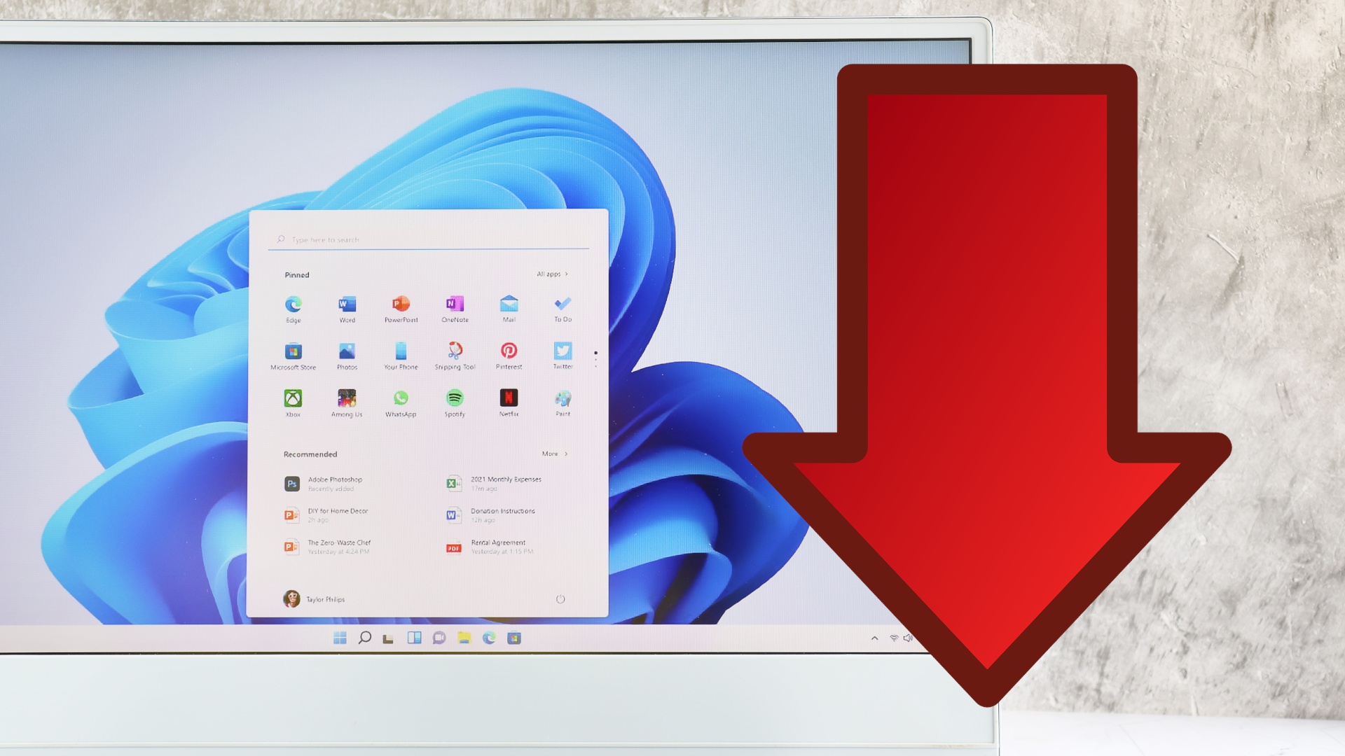
Even leading Windows managers are apparently not fans of the current Start menu. (Source: stock.adobe.com – Sai)
If you want to know how the current Windows 11 start menu is received by users, you don’t need to scroll further than the comments on many articles on the topic on this page. Spoiler: The menu is anything but popular.
Many users wish they could go back to Windows 11, when the menu was on the left and useful – or even dream of the good old Windows 7 or XP days.
But it’s not just users who are annoyed by what Windows 11 has done to the start menu. Even a senior Windows manager has made several negative comments about the current experience.
4:33
Do not try this! – How bad is it to delete the System32 folder from Windows?
Windows Manager: Start Menu make it great again
What happened? The manager is Mikhail Parakhin, CEO of Windows Advertising and Web Services. He commented twice on X (formerly Twitter) about the current user experience with the start menu.
It all started with a response to a user who used the button Alle Apps
in the start menu complained. You don’t need it at all, you should be able to scroll through all the apps directly instead.
Parakhin agrees with the user:
That’s so true! It really bothers me too. I encourage the team – we need to make the Start menu great again.
Link to Twitter content
But this is not the only place where Parakhin subscribes to the community’s criticism of the start menu. Just a day later, he responded to another user who wanted a feature back that was lost when Windows 11 started: the ability to move the taskbar and thus also the start menu to the left, top or right edge of the screen.
Parakhins agrees with the user in principle, but also has an explanation for the missing function:
Yeah, I don’t like that either. The problem is, in Windows 11 you have the widgets on the left and the Copilot on the right, which conflict with the left and right position of the taskbar.
Link to Twitter content
Parakhin also responds to a post that comments negatively on changing windows in Windows. In his opinion, switching to the last active window is currently too cumbersome:
I keep thinking about it myself. It’s not obvious that switching to the last window is a solution – sometimes you need to switch to another window. I don’t like the current mechanism either – wait, look at little pop-ups, switch, realize it was the wrong window.
Why is that important? Of course, comments from a manager are different than actual updates that improve the user experience. Nevertheless, Parakhin’s statements can be interpreted as a good sign if you are dissatisfied with the current start menu.
His contributions make it clear: Leading managers at Microsoft are aware of the problems with Windows 11 – and are apparently also interested in fixing them.
Nevertheless, Microsoft must follow up its talk with action. It remains to be seen when and in what form the Windows 11 start menu will actually be revised. Until then, users can only switch to an old version of Windows, use third-party software or make do with the current menu.
Read more on the topic: Windows 11: I make these settings immediately after installation to improve the taskbar
What do you all mean? Are Parakhin’s statements a good sign that Microsoft is listening to the community’s problems? Or do you pay little attention to his words as long as they are not underlined by patch notes? Does the current start menu bother you, have you come to terms with it – or do you use third-party software like Start11 yourself? Write it to us in the comments!


