In April, the first players were allowed to take their first steps in Diablo 2: Resurrected. As part of an alpha test, a lot of feedback was also collected for the developers. In one new blog entry Now explains to Blizzard what changes have been made based on the feedback.
more on the subject
This is how Diablo’s secret addiction formula works
By the way, our author Christian Schwarz spent the night to find out why the Diablo games with their suction from Loot and XP captivate us for such a long time in front of the monitor. This is how he discovered the secret addiction formula from Blizzard.
The fan feedback was heard
It’s not long until the release on September 23, 2021. Nevertheless, behind the scenes, the modernized new edition of the legendary action role-playing game is still being worked on. In the past few months, numerous changes have been made in many areas to ensure a better flow of the game and increase comfort:
- Sorceress: When the magician shoots lightning bolts at her enemies, the effect looks more like the original again. The same goes for their ice magic, which brings cold death from above.
- Holy Frost: The aura of the paladin has also been adapted to the model from the original.
- Color changes for effects: Numerous effects have been adjusted in color, for example when monsters take damage or are unable to move. The colors have also been revised when taking potions and changing status effects.
- Changed animation: The speed of the animation when returning mana and life energy to your character should now better match the respective balls.
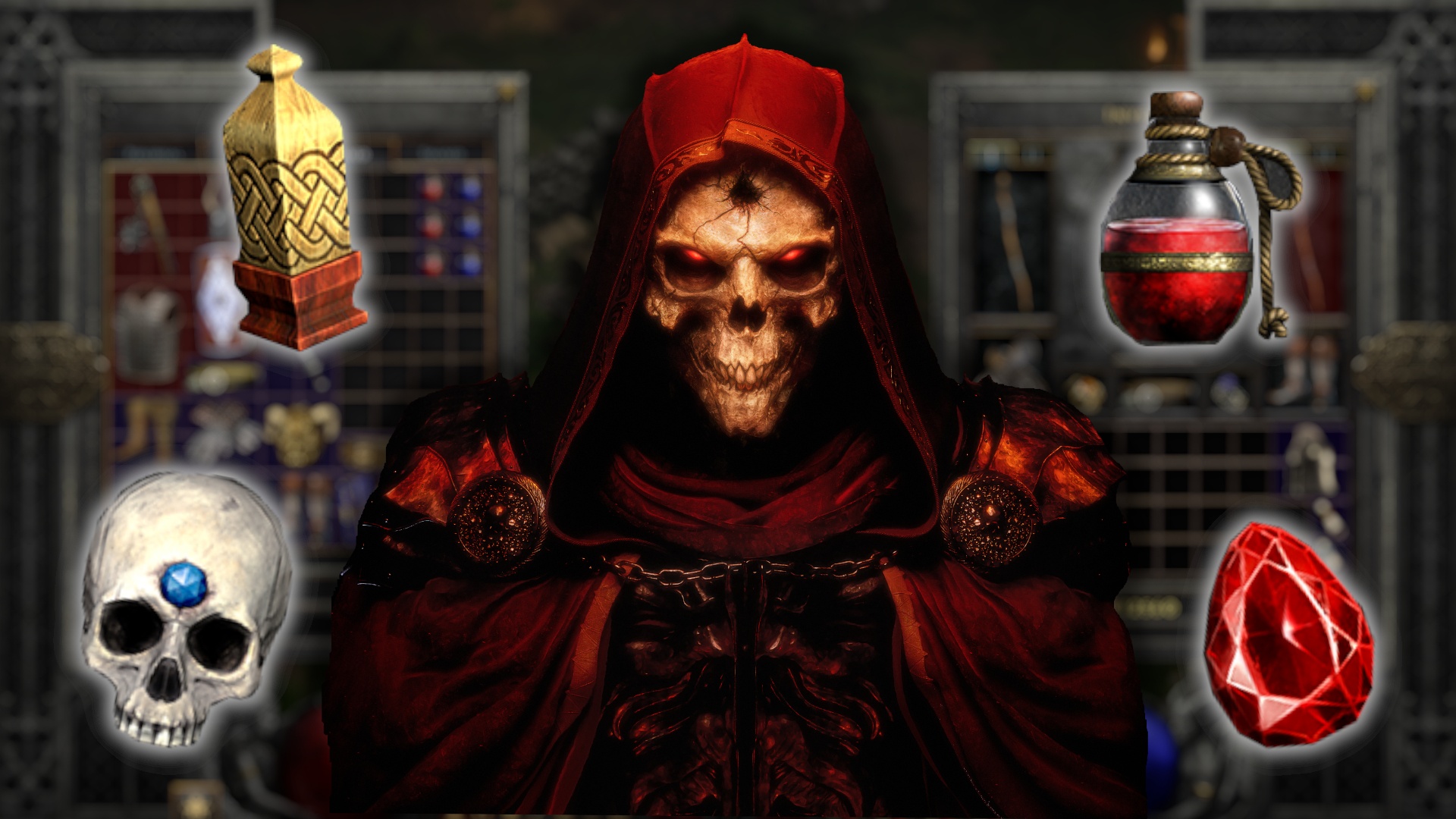
- New – icons: A whole series of icons has been revised again to find a better compromise between being true to the original and repainting. These include potions, gems and weapons and shields.
- Quality-of-Life: The series of improvements in comfort is long. Automatic collection of gold, large fonts for better readability, UI scaling, gamma / contrast controls and other features were built in based on player feedback.
- Itemnamen: These can now also be hidden and shown by pressing a button instead of holding the button down.
- Common inventory: The shared storage room now extends over three tabs and can now hold an impressive 300 items instead of 100.
-
Tooltipps: “Press
to compare” can now be deactivated if desired so that it is not displayed for every item. -
The Automap has been further optimized in terms of legibility
-
The Minimap can be displayed in three different positions – left, right or centered.
- A clock has been added so that you always know how much of the night has already passed
Further changes until the open beta
According to Blizzard, this list isn’t even complete. Rather, there should be other changes that were made based on player feedback. Fans can see this for themselves in the Open Beta, which is due to start in August. Further information on participation and scope can be found here.
Incidentally, we recently asked for a lot of feedback from you – and you did not disappoint. Several thousand votes were cast to choose the GameStar community’s favorite class. You can find out who won here.


