Among all the features in which they can be compare iOS and Android, design is one of the aspects in which the iPhone operating system wins hands down. However, Google didn’t leave it there and it is moving towards a minimalist aesthetic every year that can be seen in Android 12 in all its glory.
In October of this year, Google confirmed its plan to introduce more native user interfaces for Apple. In anticipation, there are already those who have created their own
Thus, the designer Parker Ortolani shared via 9to5mac, his design proposal for six of the most used applications in the App Store created by Google, redraw them with Apple UI elements
The most popular Android apps as native to iOS
Here we share a proposal of what they would look like Google, Chrome, Google Maps, Gmail, YouTube and Google Docs if Apple had been in charge of its design.
Youtube
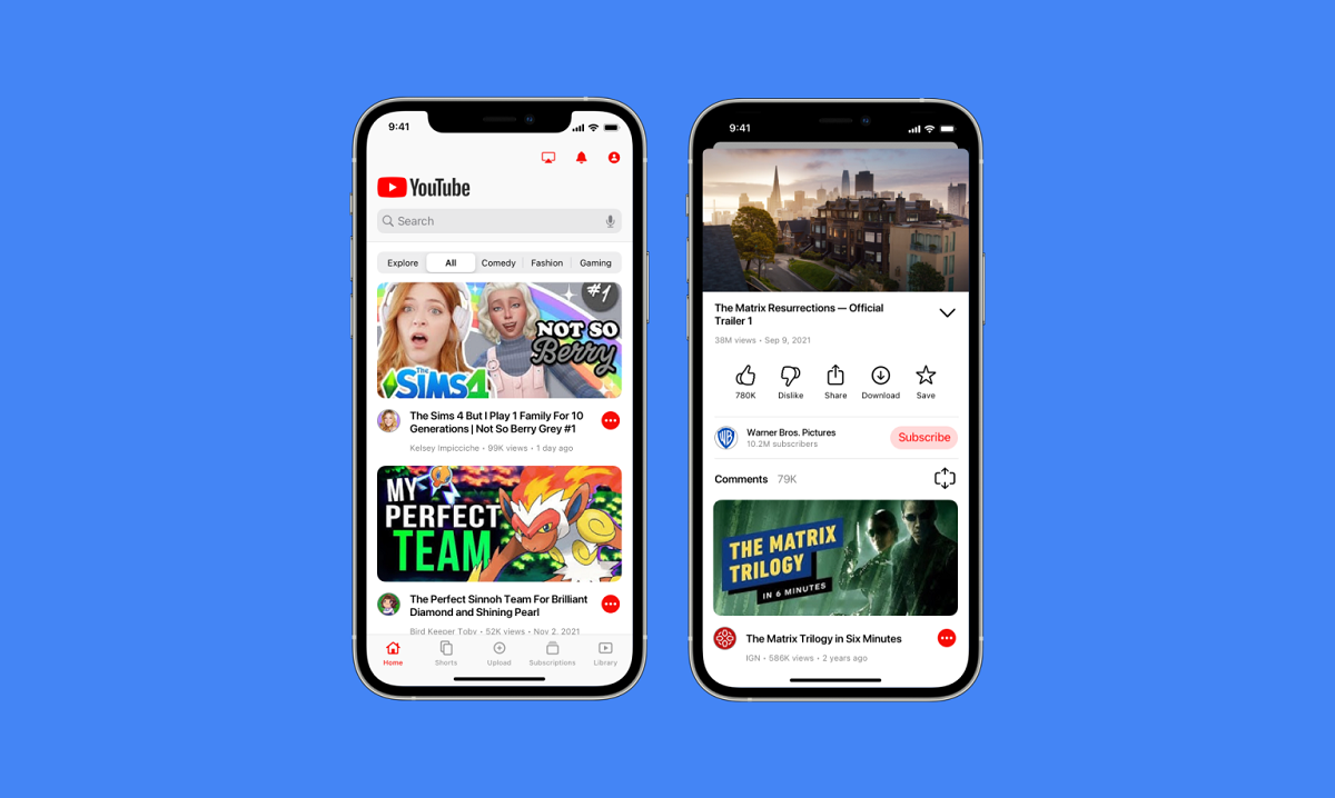
In the video app proposal, highlight a modal view stacked when viewing a video instead of Google’s custom fullscreen mode. As good as redesigned and more widely spaced icons, for a minimalist look.
One of the changes needed to appreciate apps from this point of view is Replacing the Chromecast icon in the top toolbar with an AirPlay button, essential for users of the Apple ecosystem.
Google maps
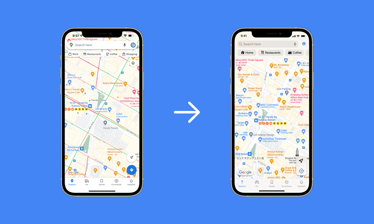
Based on this redesign, the app that Apple hadn’t been able to beat, until iOS 15, would look without the floating search bar with the thick shadow. Instead, you can see a standard navigation bar that has a search box, an account button, and below them a series of filters with more native buttons. Meanwhile the floating buttons in the corners they are more like Apple Maps.
Google chrome
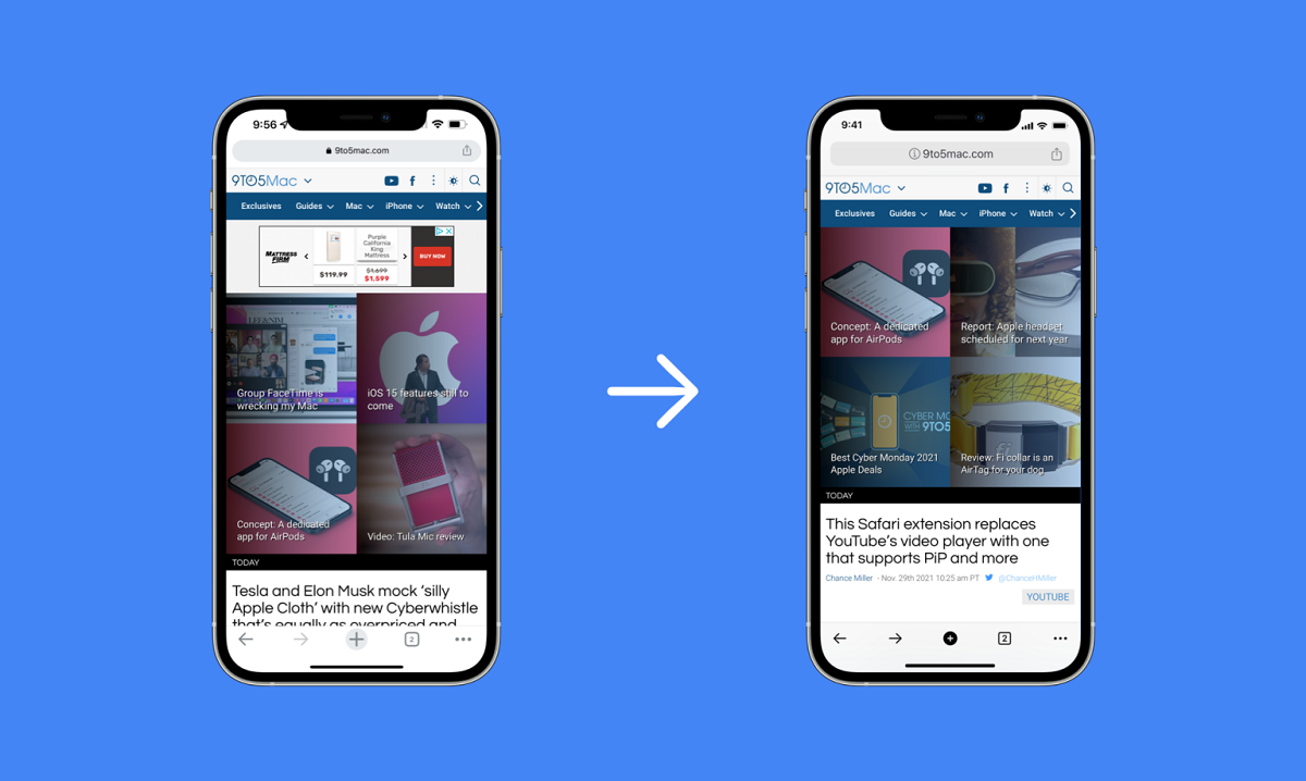
The aim of this concept was to give it a more similar to an Apple Safari. It was one of the more understated redesigns, however, and it’s still clearly from Google.
Gmail, Documents and Search
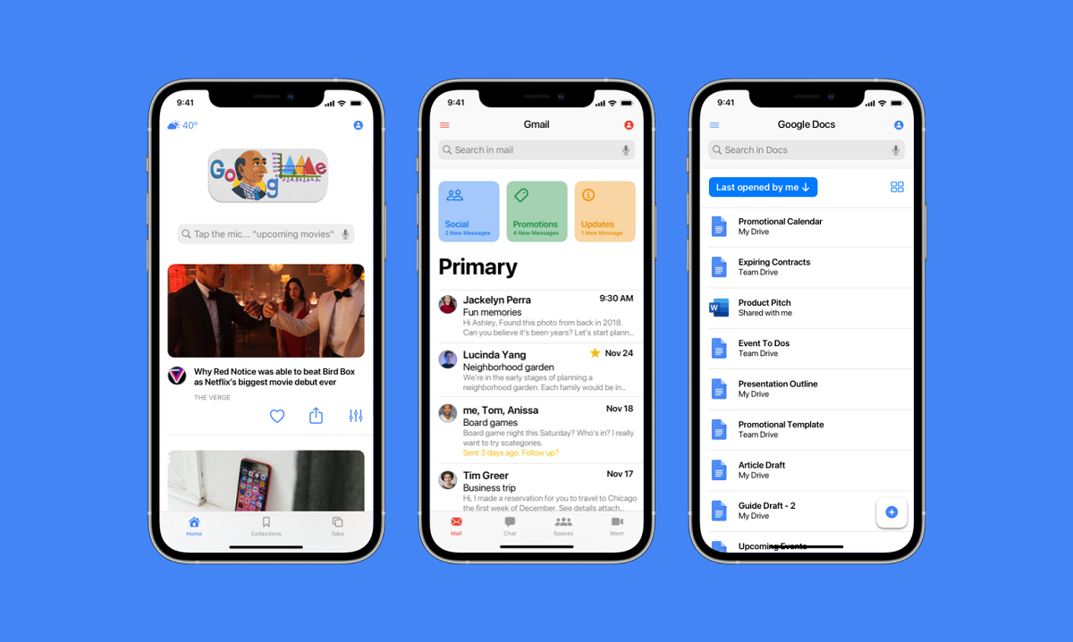
Gmail is one of the concepts that received the most changes to look like a native Apple app. The first was the home app square button design and adapt it for others three mailboxes located above the main inbox.
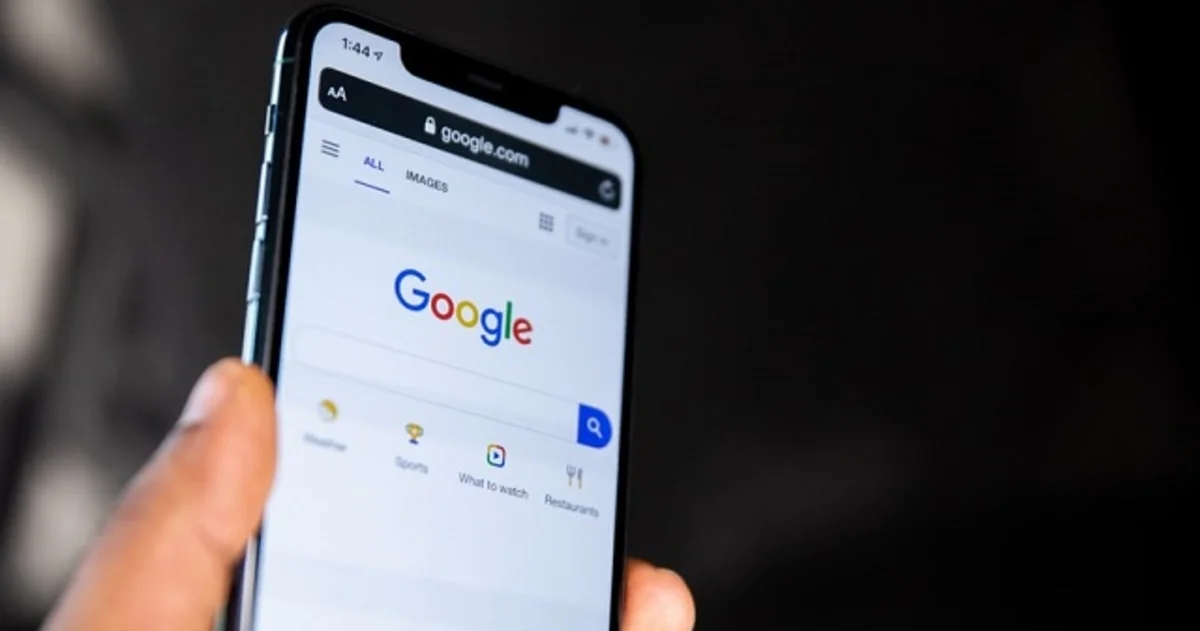
For its part, Google Docs didn’t need a lot of tweaking. It certainly looks like Google Docs, but it’s also clearly a native iPhone app. Finally, the Google search engine shows subtle changes in the search box and some buttons, being quite similar to Google’s proposal.
While Google’s announcement ended the ongoing demand by iOS users to receive apps created for the device, it’s not something we’ll see overnight. While How successful do you think this proposal is?
Related topics: Google
Subscribe to Disney + for only $ 8.99!
Table of Contents

