Related news
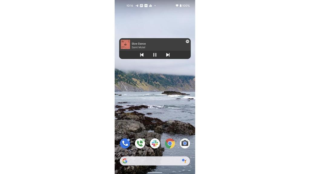
Like the song ‘Todo es de color’ by Lola and Manuel, Spotify follows the steps of Android 12 to give you a complete renovation of your widget and fill it with color according to the cover of the album being played.
A color that comes to Spotify like it did to Android 12 in the version 8.6.40 / 42
Everything is colorful
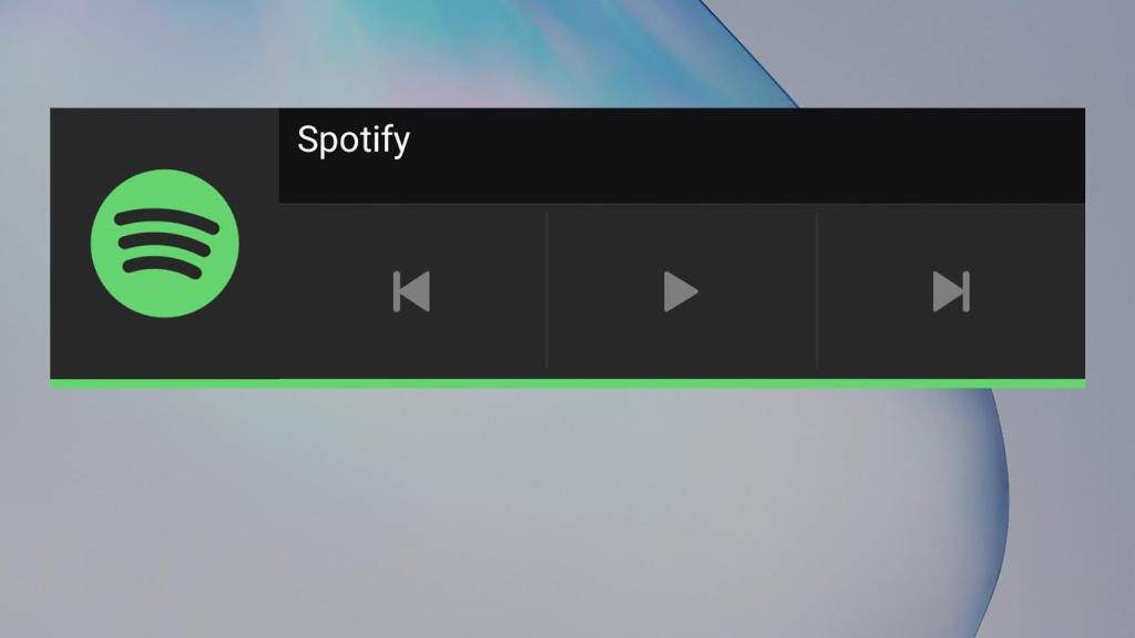
A new widget that is part of the update 8.6.40 / 42 from Spotify to play the current Olympic, quite bland by the way, and give it that touch rounded corners and the theme, which will go hand in hand with the key color of the album cover being played.
At the moment, this novelty is not well enough implemented, because it does not support the Android 12 theme which is taken from the wallpaper
A widget more in line with current design trends interfaces that we even saw in the beta of WhatsApp with these rounded corners, also present in Windows 11.
Curious is that now the streaming service is give the necessary importance when two years ago he recovered it from the bag of oblivion.
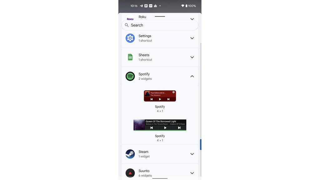
This widget can be readjusted to increase its 4×1 size by default. And of course, it is properly extended for the viewing experience to be optimal and appropriate.
At the moment, we don’t know when we will have possibility to test this widget which will replace the current one from Spotify, although by the captures provided by 9to5google it will be added as another to be a total of two widgets.
.

