Related news
Among the latest news related to the Play Store, we had the scores separated by device, so today the web version get a redesign to look like the android app.
The web version of the Google Play Store has showed some changes in recent years, although none have been really flashy that the experience has changed enough.
The Google Play Store lacks a side menu
Thanks to some Reddit users, we even have some screenshots of how it’s going to be redesigned the Google Play Store for an improved version that would go hand in hand with the one we have on our Android phones.
Google play store
Free Android
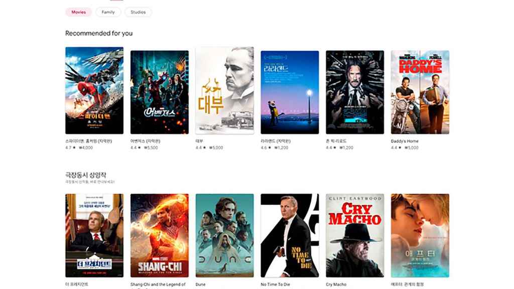
The first thing that emerges from these changes, apart from the deletion in the middle the gray color background to replace it with white, it is the fact that the side menu has disappeared.
Instead of this menu, let us gave access to the main sections in the google store we have four top tabs for games, apps, movies, and books.
Google play store
Free Android
After making these changes, you focus on reviewing these huge cards for games the hottest, content that will change depending on which section we are in.
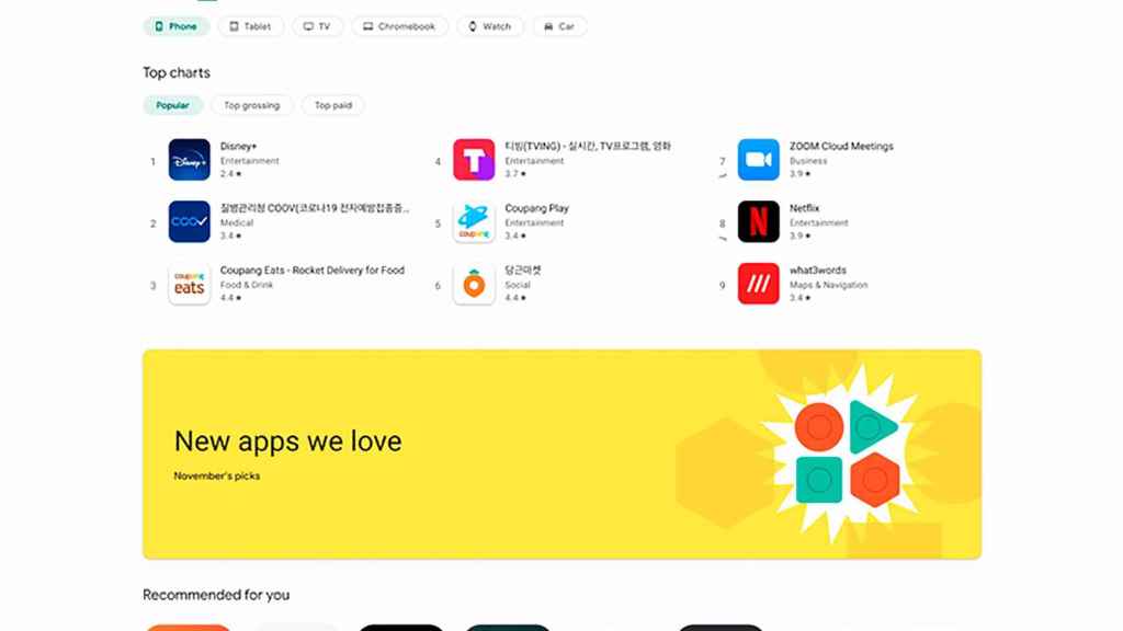
Filter content by device
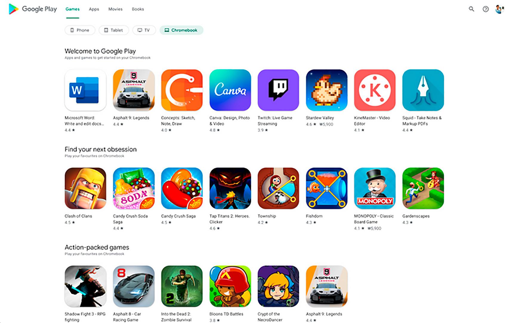
In its desire to improve the store experience, Google has included a striking option that we already have in the Google Play Store app to display content depending on the chosen device.
Filter by devices in the Google Play Store
Free Android
That is, in the web version of Google Play, we will be able to filter app and game content by device: mobile apps, tablets, TV, Chromebook, smartwatch and car.
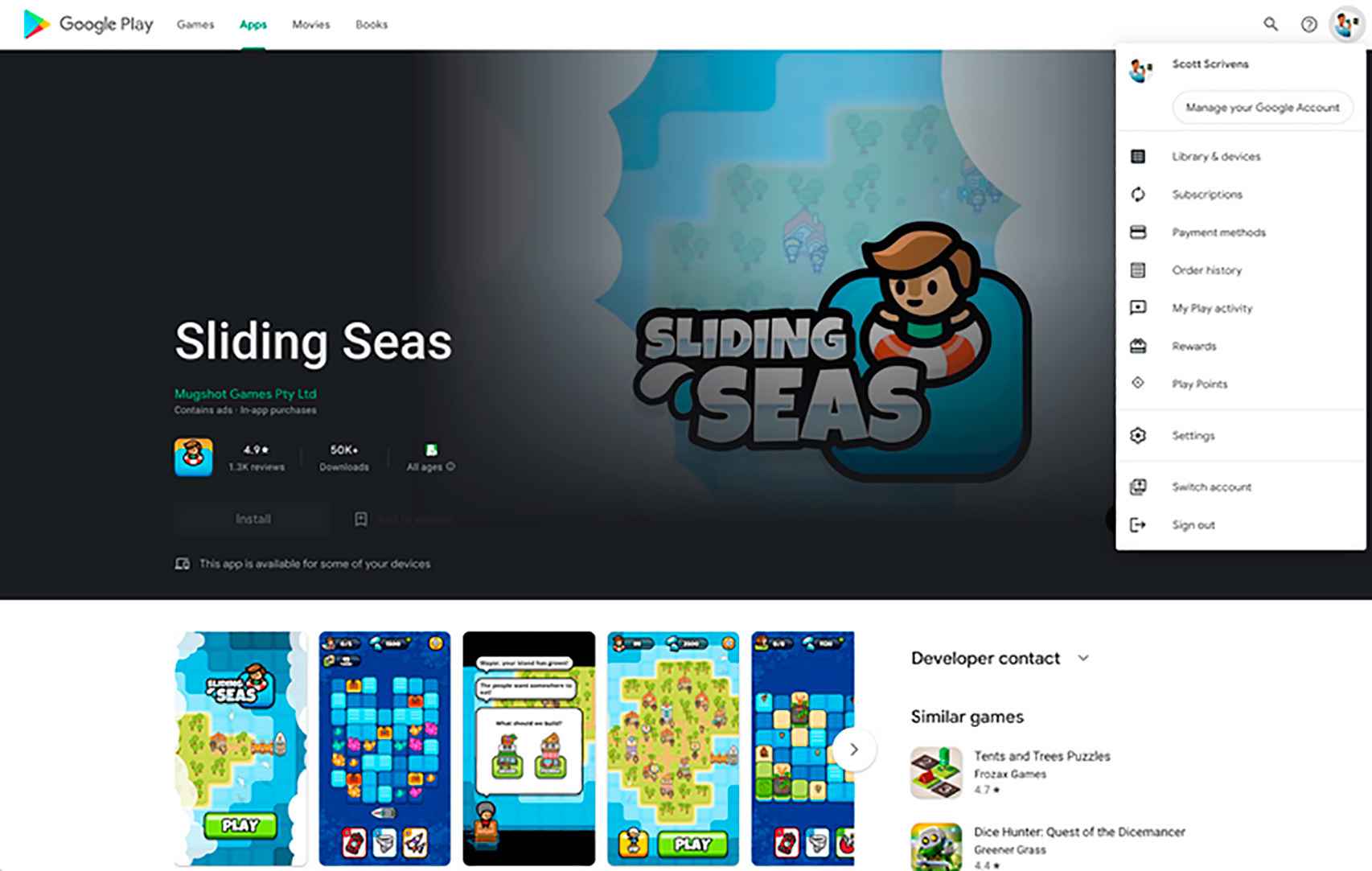
And as in many apps that were updated last year with this side menu that has disappeared, in the Google Play Store we now have the settings section and more in the top icon shifted a bit to the right.
Google play store
Free Android
Nothing we are not currently used to in the Android version, so you will be able to access your subscriptions, payment methods, order history, activity, rewards and settings from this new space.
The change undergone in the game page, app and more
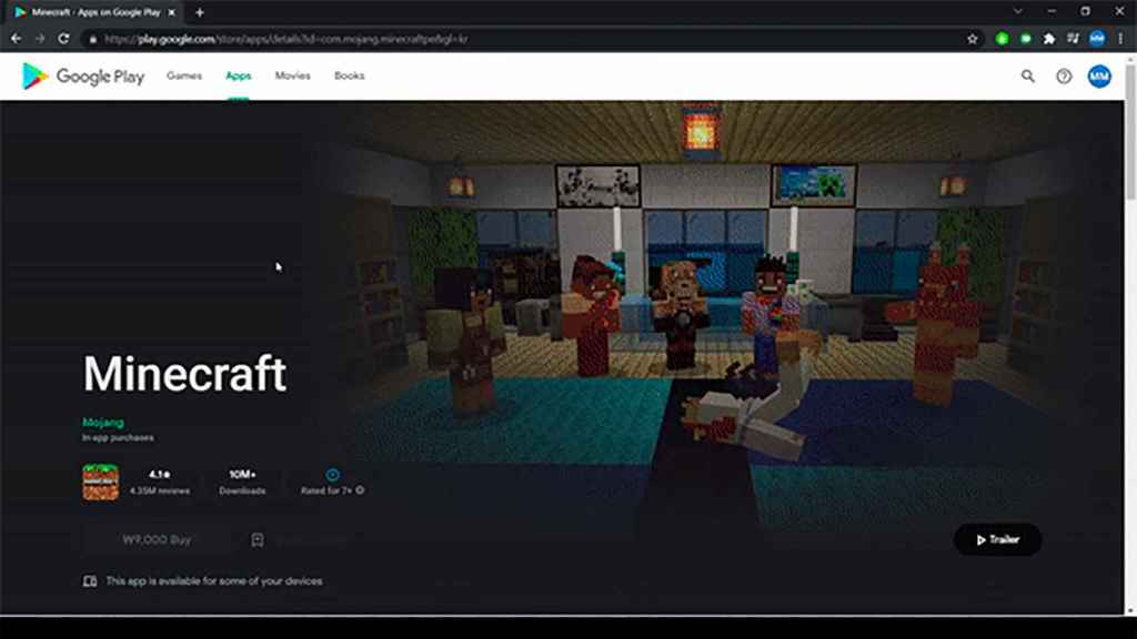
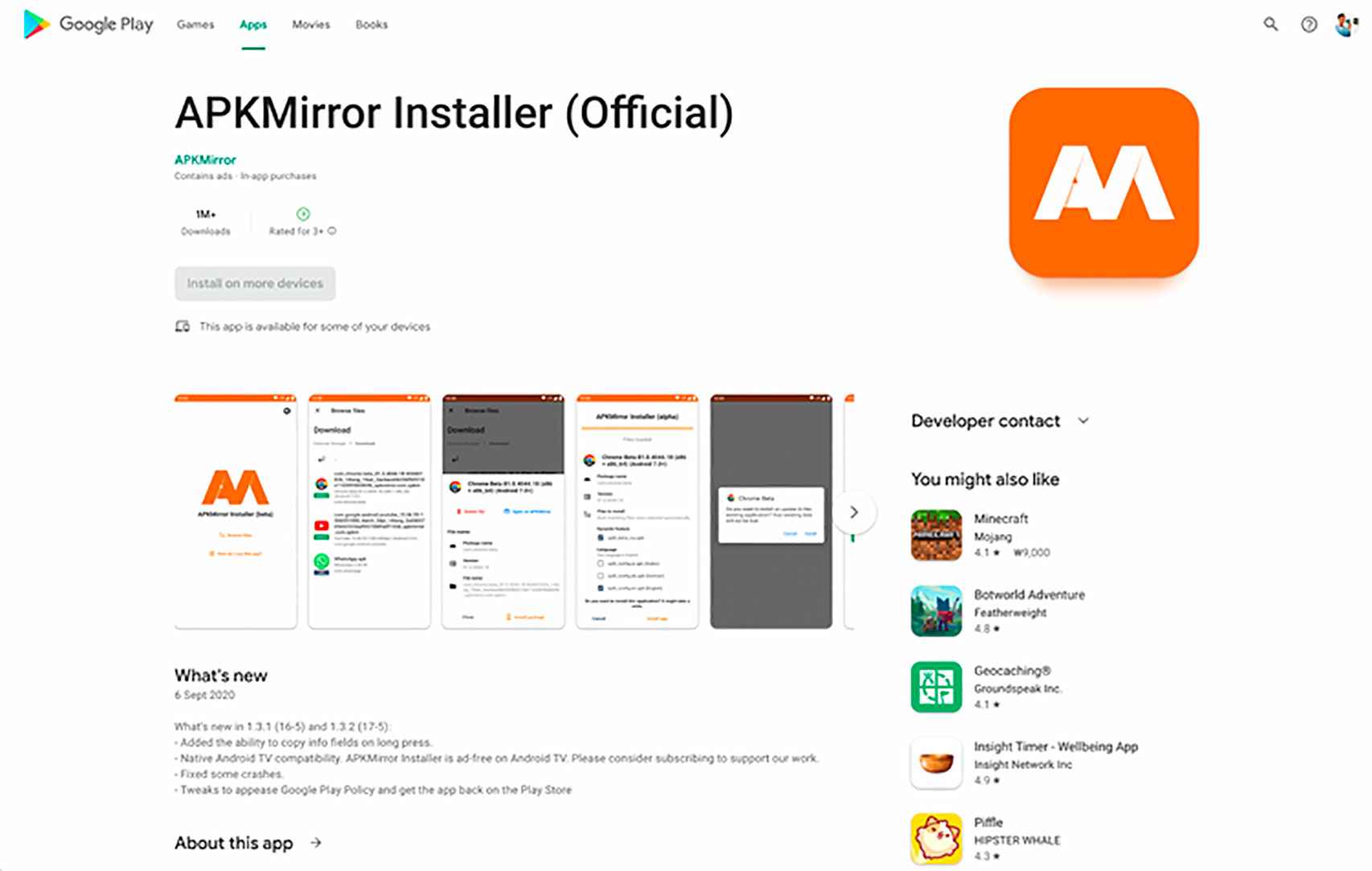
The other big obvious change is in the game or apps page, since the game title will appear bigger what we are used to.
The app title appears in a larger size
Free Android
The rest of the information in the app or game is same as Android version, apart from a side menu for contact with the developer or suggestions for the application.
Applications section
Free Android
Another of the changes made in this redesign of the Google Play Store is in search engine. This now includes a more suggestions and shortcuts to apps and games when we’re almost done typing their names.
A major change for the Google Play Store experience, via Android Police, from a desktop or laptop to make it look even better on smaller screens. In other words, the interface with its elements evolves better.
it may interest you
Follow the topics that interest you
.
Table of Contents


