Be sure to cast your votes in the poll below; but first, let’s look at the box designs themselves.
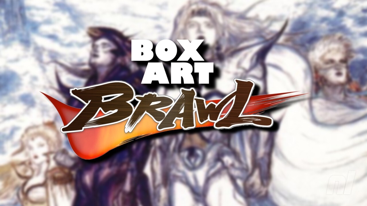
North America

So this is basically your “quintessential” Final Fantasy cover, with a beautiful title font set against a nice image of the antagonist Golbez. However, what’s interesting about the North American version is that the standardized color palette for Final Fantasy is actually reversed, with the title in white and the background in black. Golbez’s picture, meanwhile, is all shiny and beautiful. ooh
Europe

So for Europe, the lineup is exactly the same as the North American counterpart, but the colors are much more in line with the “traditional” Final Fantasy image. The title font is now black, the background is white, and the Golbez image is now mostly blue with touches of orange and red.
Japan

Okay, so Japan is really bucking the trend with this one, using the skills of Final Fantasy illustrator Yoshitaka Amano for the cover. We see the main protagonists of the game in the foreground with a whole bunch of airships and clouds in the background. It’s a striking piece for sure, but is it as iconic as the European/North American approach…?


Thanks for voting! See you next time for another round of Box Art Brawl.
Table of Contents
![[Rumor] The possible return of Zelda: Breath of the Wild brings to light another Nintendo Switch 2 codename](https://www.nintenderos.com/wp-content/uploads/2017/11/the-legend-of-zelda-breath-of-the-wild.jpg)